
Francesco Perchiazzi
Design Director
Research · Education · Capability Building
Design direction through visual culture, experimentation, and making.
The practice connects interfaces, services, games, and XR with emerging agentic workflows. Prototyping, tool building, and teaching help people and teams turn ideas into working methods.
Research
Questions about perception, distance, and interaction become methods and tools that others can use. The current focus is spatial computing: exploring how people encounter digital content around them before committing to a platform.
Instruments
Open tools for exploration. Freely available.
K.I.T.E. UX. Knowledge-Integrated Topological Editor for User Experience
imaginary institute · 2026 · WebXR, Three.js · Open source
| Challenge | Methodology | Outcome |
|---|---|---|
| Explore how distance, scale, and field of view affect the arrangement of interface elements in a three-dimensional scene. | Contribution: translating a personal theoretical model into an interactive prototype, with distance overlays and colour-coded indicators that make its assumptions visible. | A browser-based tool for comparing layouts around a viewer. Its indicators are theoretical cues, not validated measures of comfort or usability. |
K.I.T.E. UX is an experimental prototype built around a personal theoretical model. It was created to explore how interface elements relate to the space around a viewer and to turn abstract assumptions into something that can be inspected and discussed.
Its value is in supporting early questions and comparisons. The model has not been empirically validated; the tool does not establish that a layout is comfortable, usable, or safe.
The workflow has three steps: Arrange windows and volumes in the canvas; Explore distance, scale, field-of-view overlays, and the model’s indicators; Export the configuration as JSON for further prototyping. Exporting a configuration records design choices; it does not validate them.
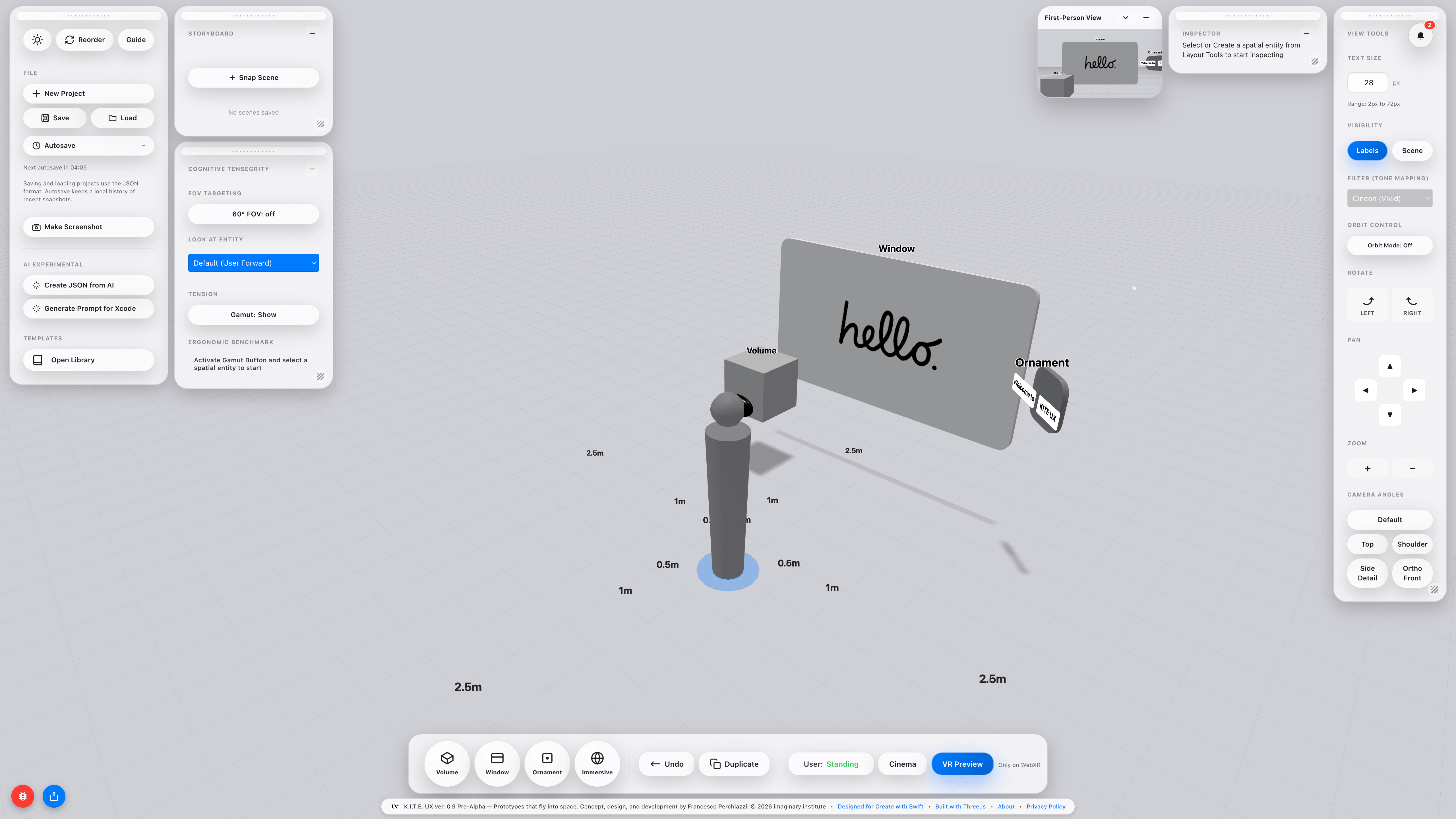
WebXR previews and the Storyboard offer different viewpoints and comparisons between saved scenes. Reference objects help communicate scale during a review.
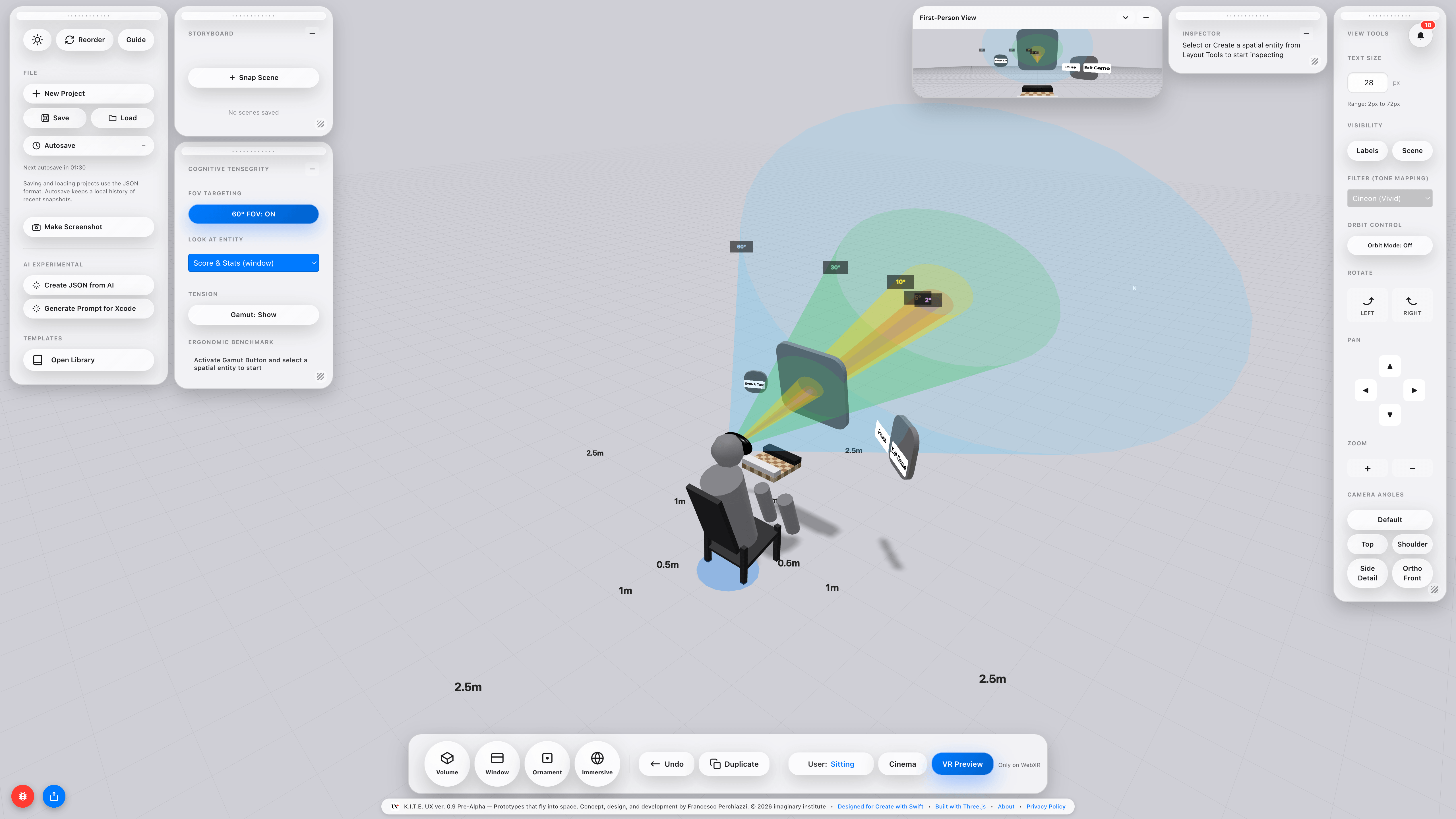
The displayed 60° field-of-view cone is a reference overlay. The Gamut Warning colours represent bands defined by the theoretical model. Labels such as “Optimal”, “Good”, and “Critical” describe those categories, not measured user responses or universal ergonomic thresholds.
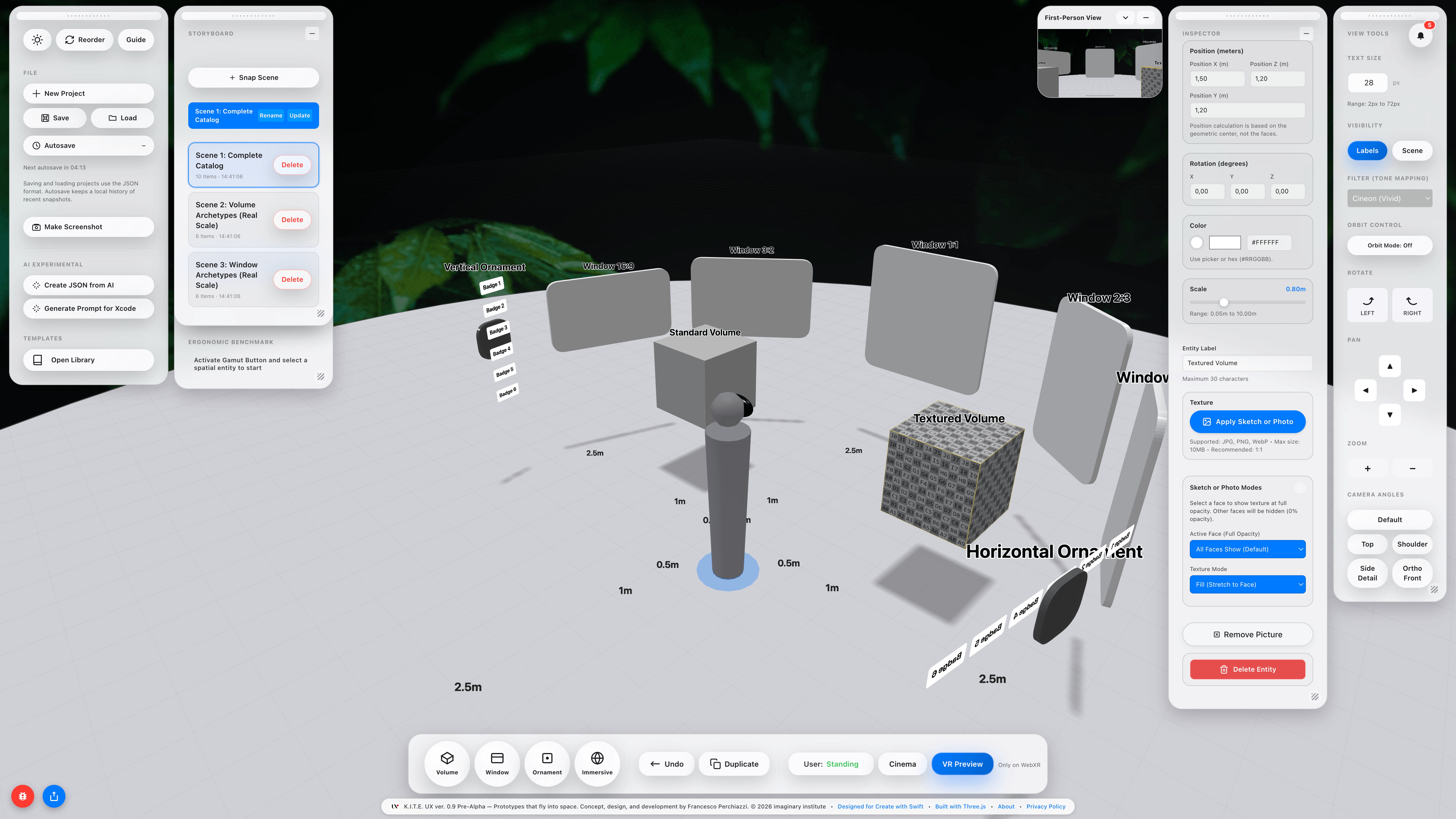
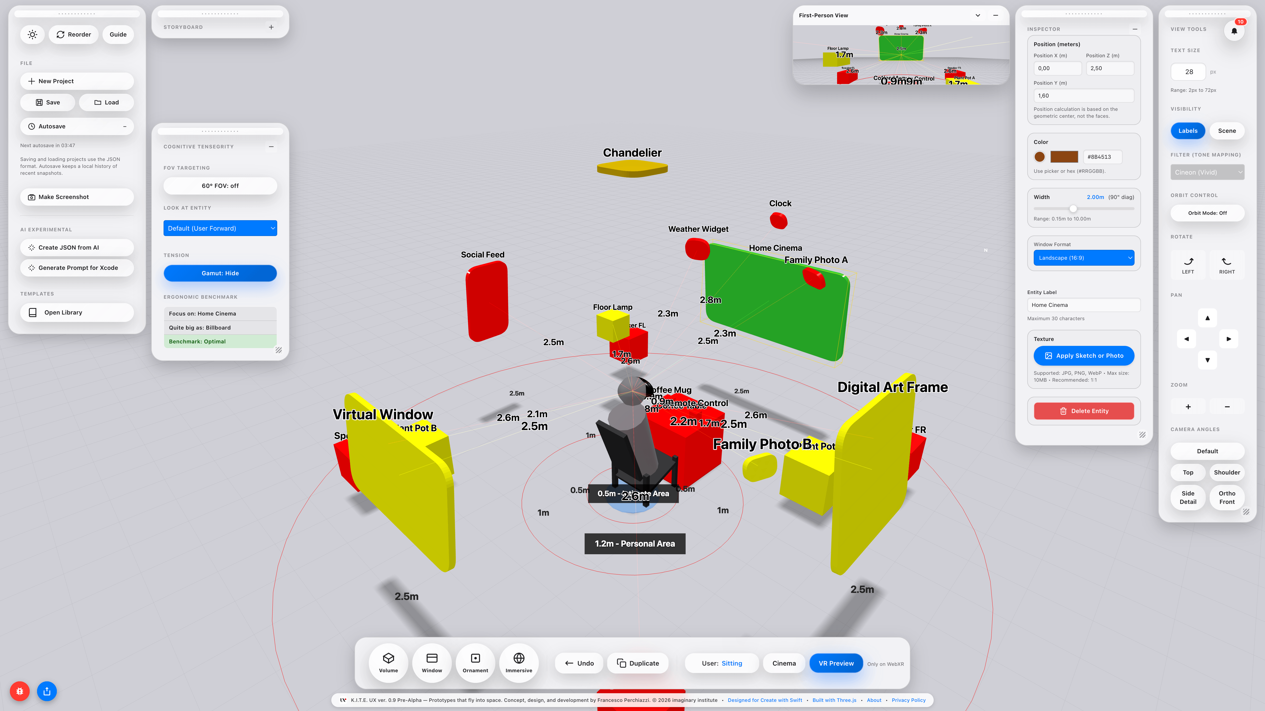
The Storyboard connects layouts into a sequence. Reviewing placement and apparent scale across scenes helps identify questions to investigate with people in the intended context of use.
The editor runs entirely in the browser. No installation, no account. Every entity placed in the canvas, whether Window, Volume, Ornament, or Immersive, carries a parametric Inspector: position in metres, scale, rotation, colour, texture upload, and entity label. Windows expose format presets (16:9, 3:2, 1:1, 9:16, 2:3) and a width slider that reports both metric size and diagonal inch equivalent in real time, bridging the physical and the pixel.
K.I.T.E. UX is available for exploratory prototyping and discussion. Try K.I.T.E. UX →
Independent prototype · 2026
visionOS-ready scene packaging: from UI frames to spatial artefacts
Package flat UI frames into USDZ spatial artefacts, ready for visionOS review. Designed for an agentic coding workflow: review Figma frames as placeable spatial objects, iterate without leaving the design conversation.
- USDZ-first
- visionOS
- Agentic coding workflow
- Open source (MIT)
TheaXRe addresses how a scene is packaged, shared, and critiqued. Teams can review their concepts at an intended scale and discuss relationships that a flat frame leaves implicit.
Independent prototype · 2026
Image to USDZ/GLB. No-upload XR prototyping
Convert any raster image into a placeable USDZ or GLB in the browser, no upload, no install. Ideal for fast XR desk reviews and student exercitations: drop a photo, tune, export for Quick Look / Scene Viewer.
- No upload
- USDZ + GLB
- 31 languages
- Quick Look / Sceneviewer
- Open source (MIT)
sXRetch is a browser-first prototyping tool built around a no-upload pipeline: every conversion happens on the client, with no account, no install, no data leaving the device. Useful for desk-scale experiments, classroom exercises, and early layout reviews before committing to platform SDKs.
imaginary institute · 2024
Speculative Spatial Design Canvas
The rise of spatial computing introduced motion sickness, perceptual fatigue, and a lack of clear interaction models. The Canvas structures pre-development decisions: concept framing, ergonomic constraints, perceptual risk mapping, and compositional intent before code begins.
- Printable PDF
- Spatial apps workflow
- Spatial games workflow
- Surgical XR workflow
- visionOS HIG alignment
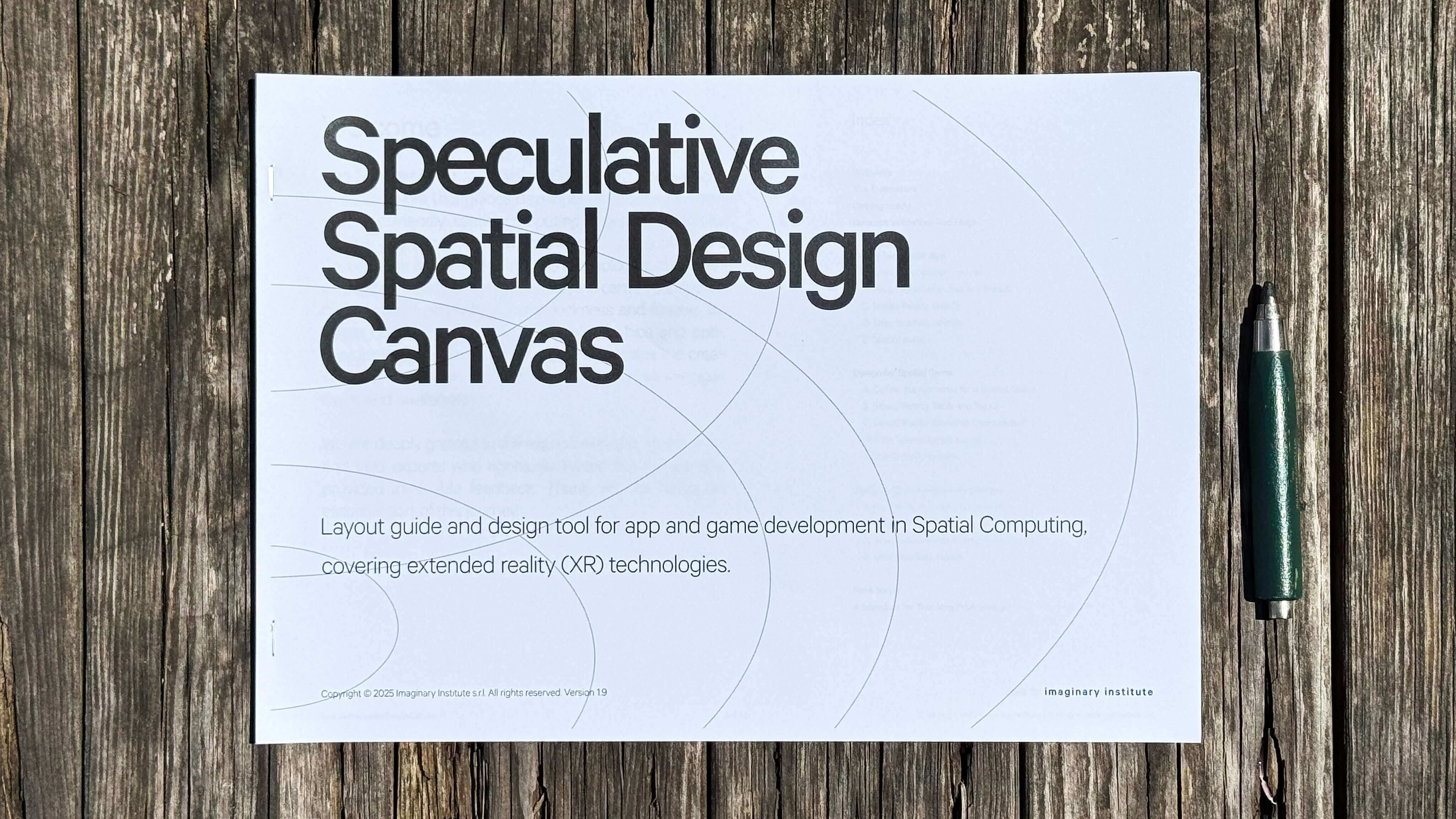
The Speculative Spatial Design Canvas supports early discussions about concepts, users, and intended contexts. It helps teams record assumptions and plan what to prototype or investigate next. Like K.I.T.E. UX, it supports exploration; completing the canvas does not validate a design or establish suitability for clinical use.
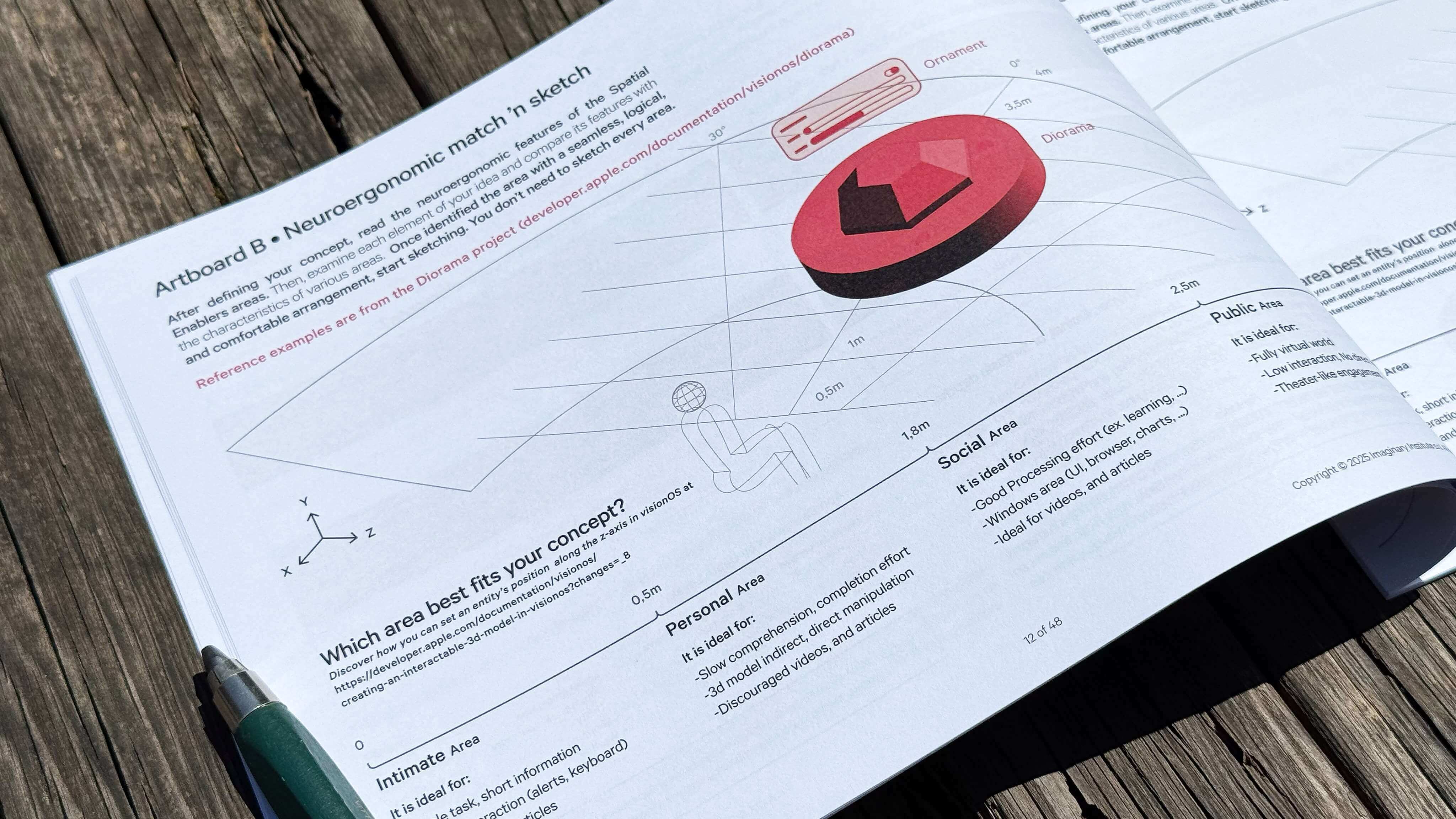
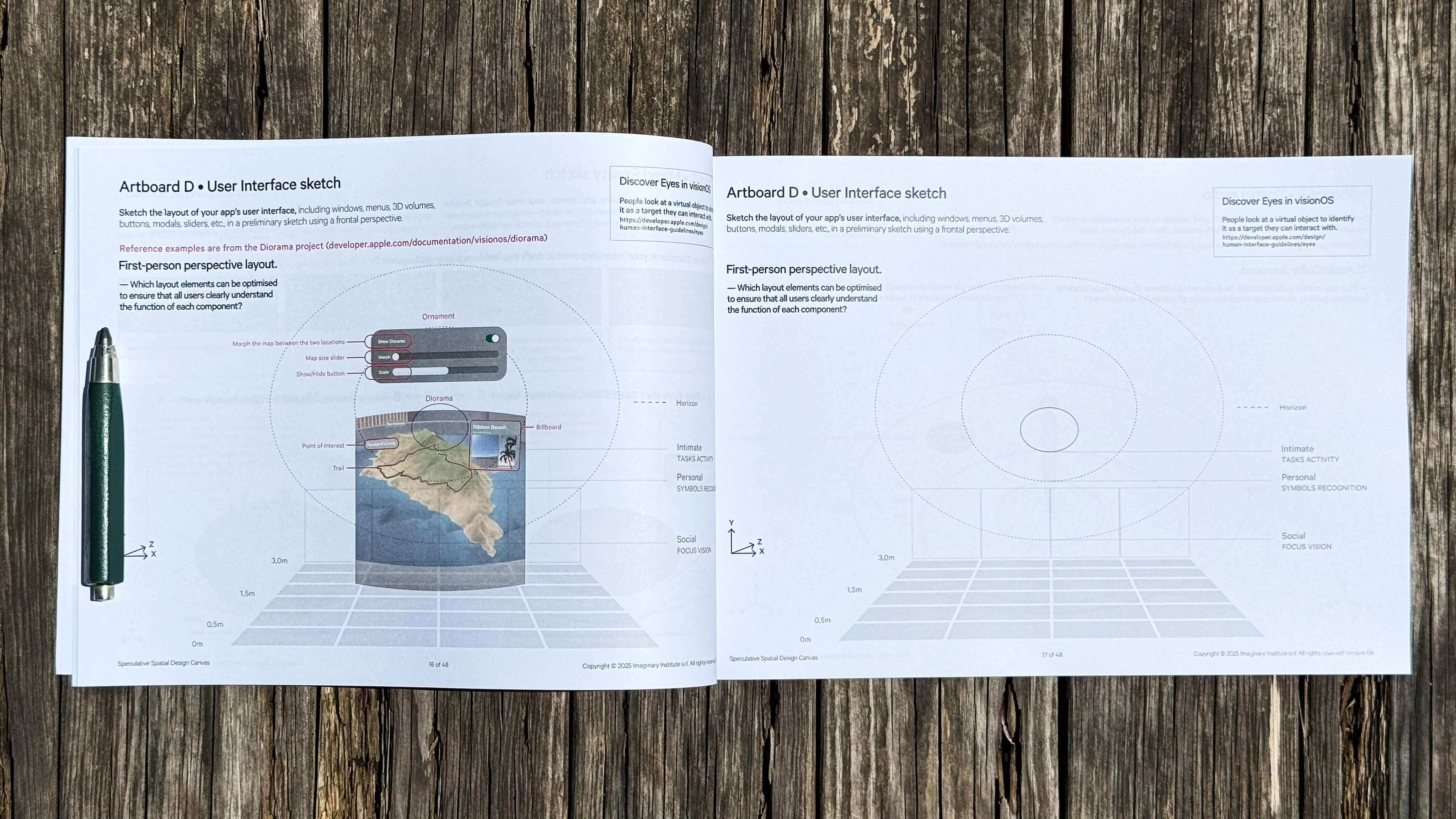
The canvas includes dedicated workflows for three main scenarios: Spatial Apps, Spatial Games, and Surgical Spatial Applications. Each pathway provides tailored examples and design prompts to guide development from early concept to refined prototype, improving team alignment and communication.
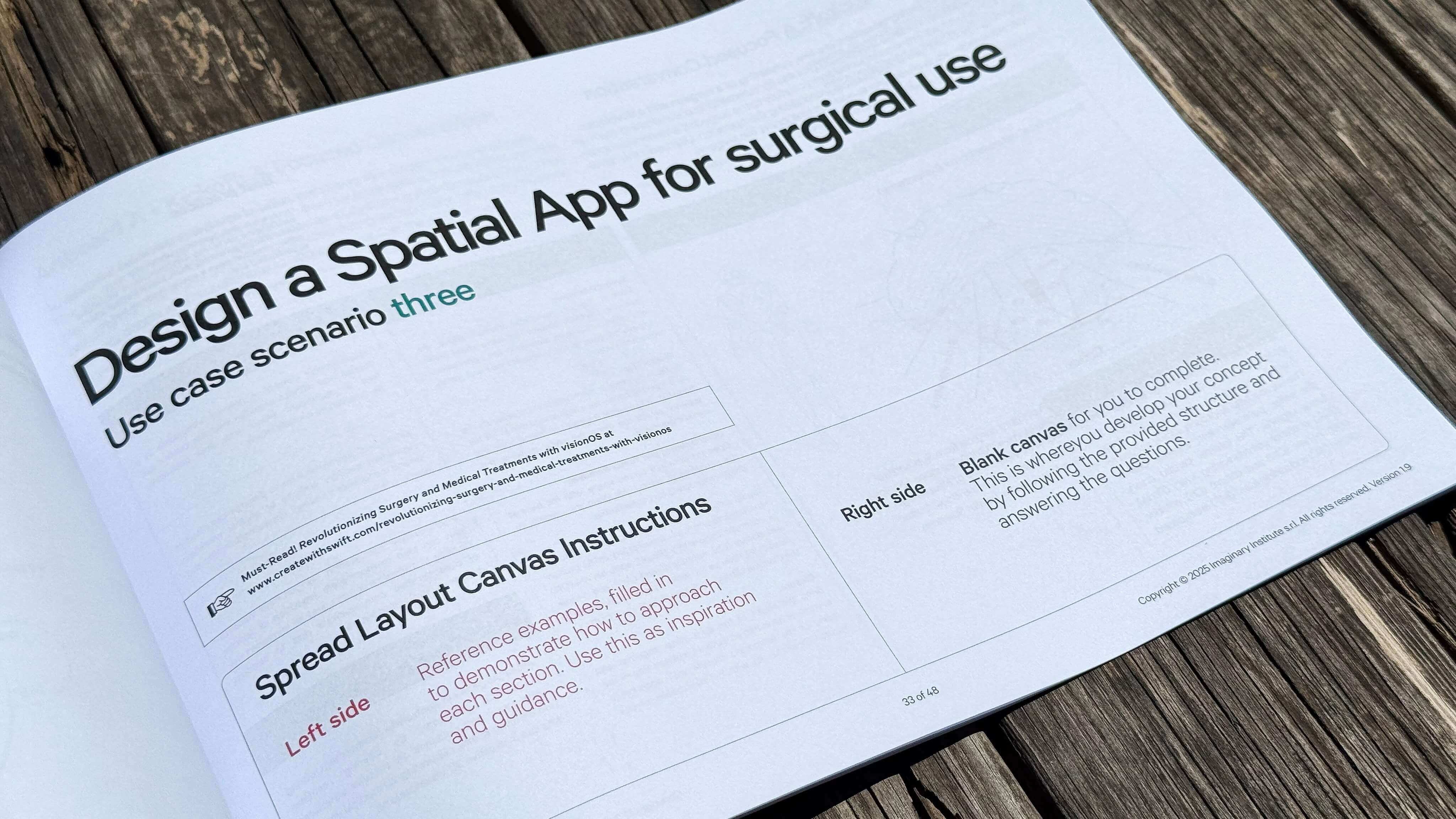
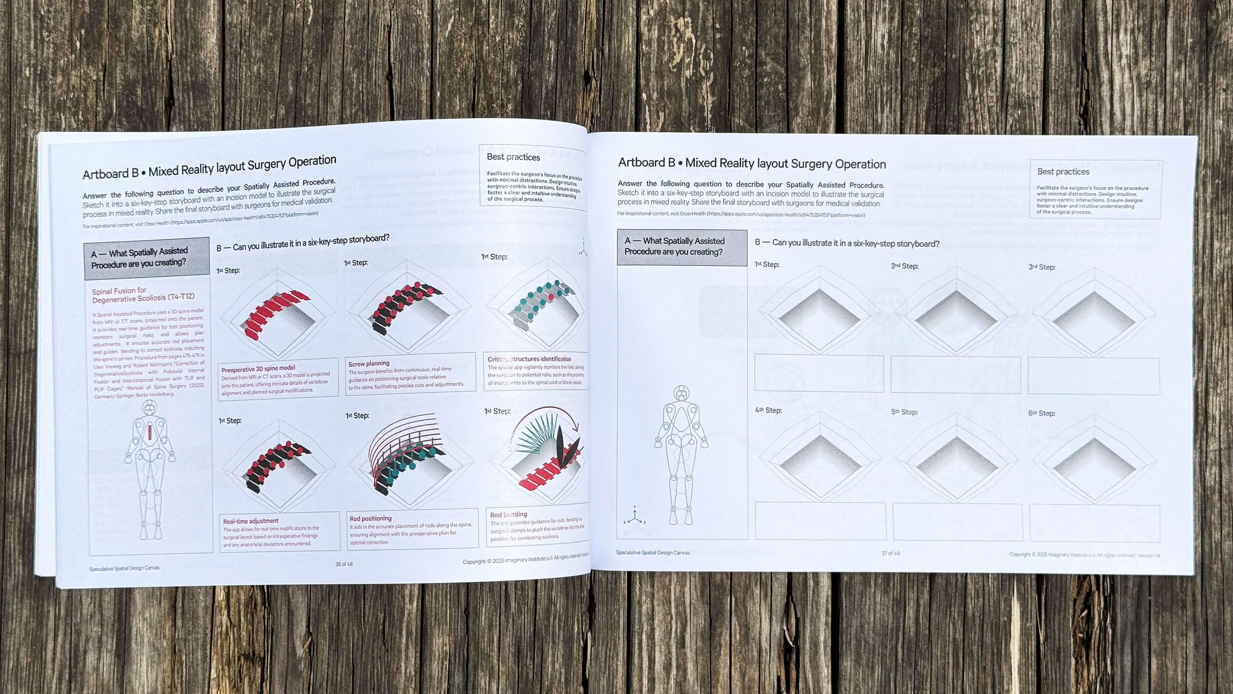
The medical workflow fosters collaboration between healthcare professionals and developers, helping envision impactful applications for Apple Vision Pro. It aligns with Apple’s visionOS Human Interface Guidelines and spatial computing best practices. While open to all, it’s especially effective for practitioners with a foundation in spatial interaction design.
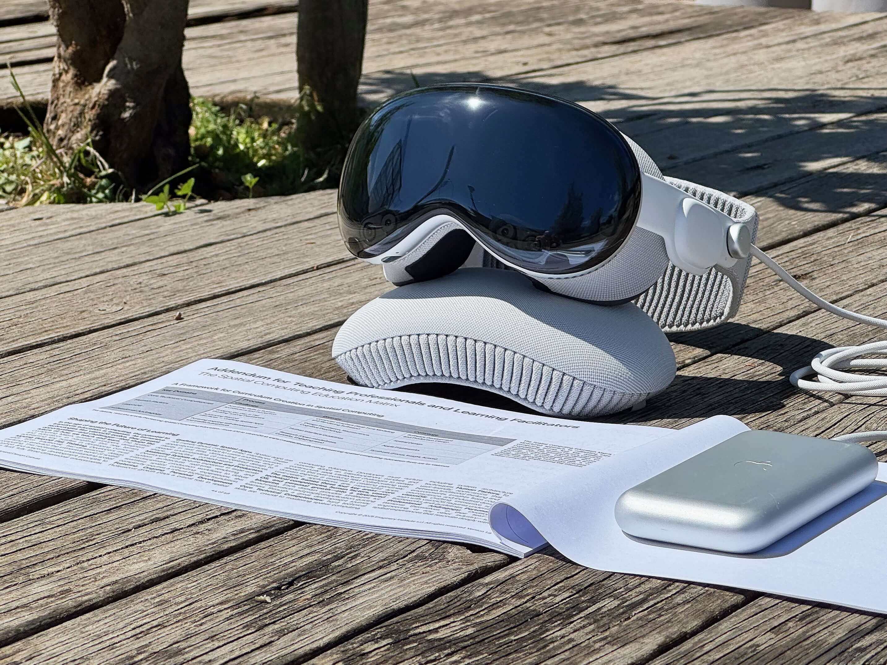
The Canvas is best used during the feasibility phase, before porting existing iOS apps to visionOS or initiating new projects in third-party tools like Unity. It is freely available via Create with Swift and developed by imaginary institute. Download the Speculative Spatial Design Canvas for free →
Independent prototype · 2026
XReate · 3D Prototype Modelling
Browser-native 3D prototype modelling for coders and learners: draw, extrude, texture, and export scene props, gameplay spaces, and XR ideas as GLB or USDZ.
- Draw & extrude
- USDZ + GLB export
- UV mapping
- Browser-native
- Open source (MIT)
XReate turns drawings and primitive volumes into textured 3D prototypes. Built for coders and learners, it makes spatial ideas tangible without requiring a full modelling suite. It is an experimental tool for learning and exploration, with projects and images kept on the device.
The three-step pipeline shown above is intentional. Doodle a shape or start from a primitive volume; Shape it with extrude, revolve, mirror, and move operations; Texture and pack an atlas, then export. Each step is reversible and inspectable, so a learner can retrace how a form was built instead of receiving it as a finished artefact.
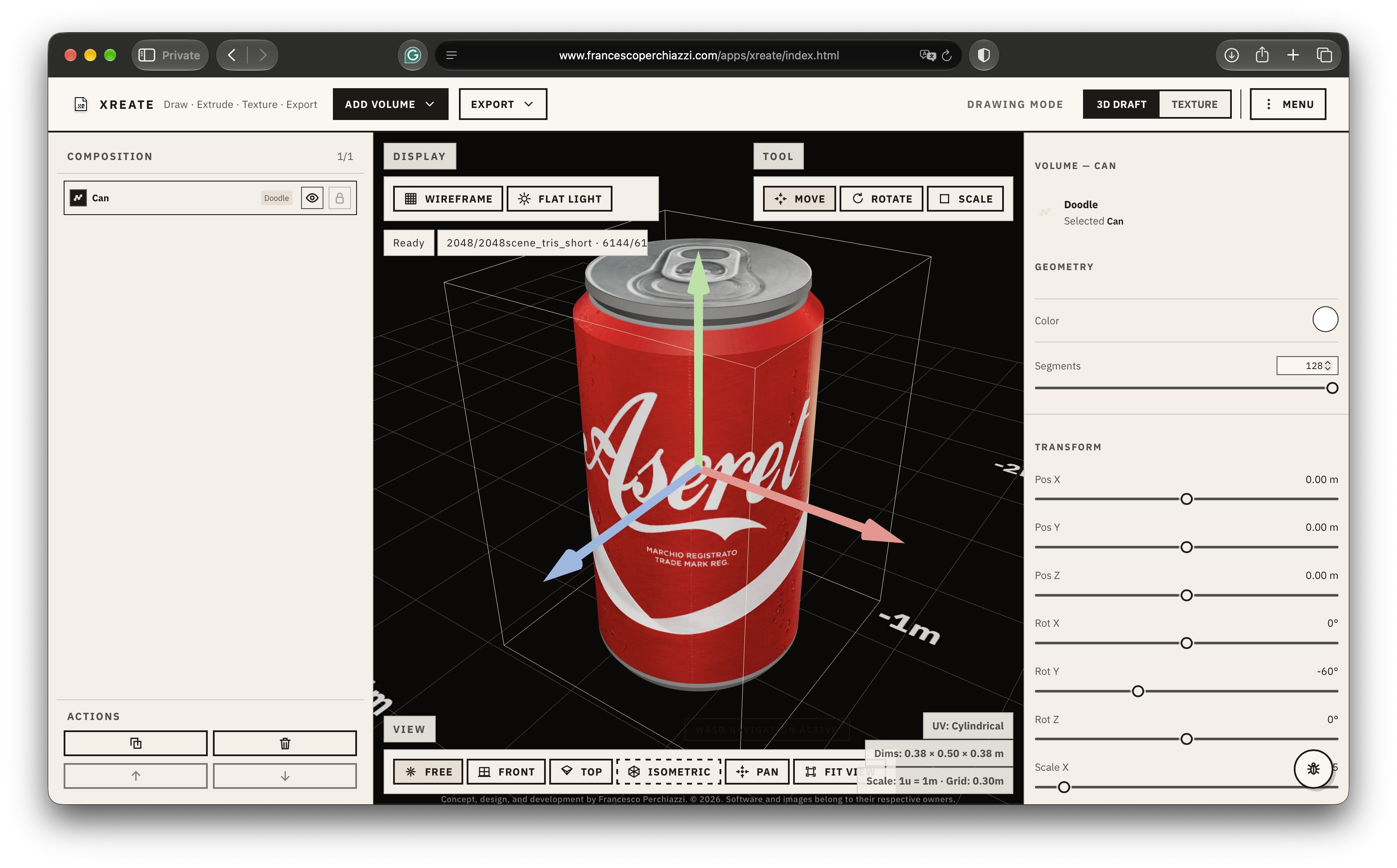
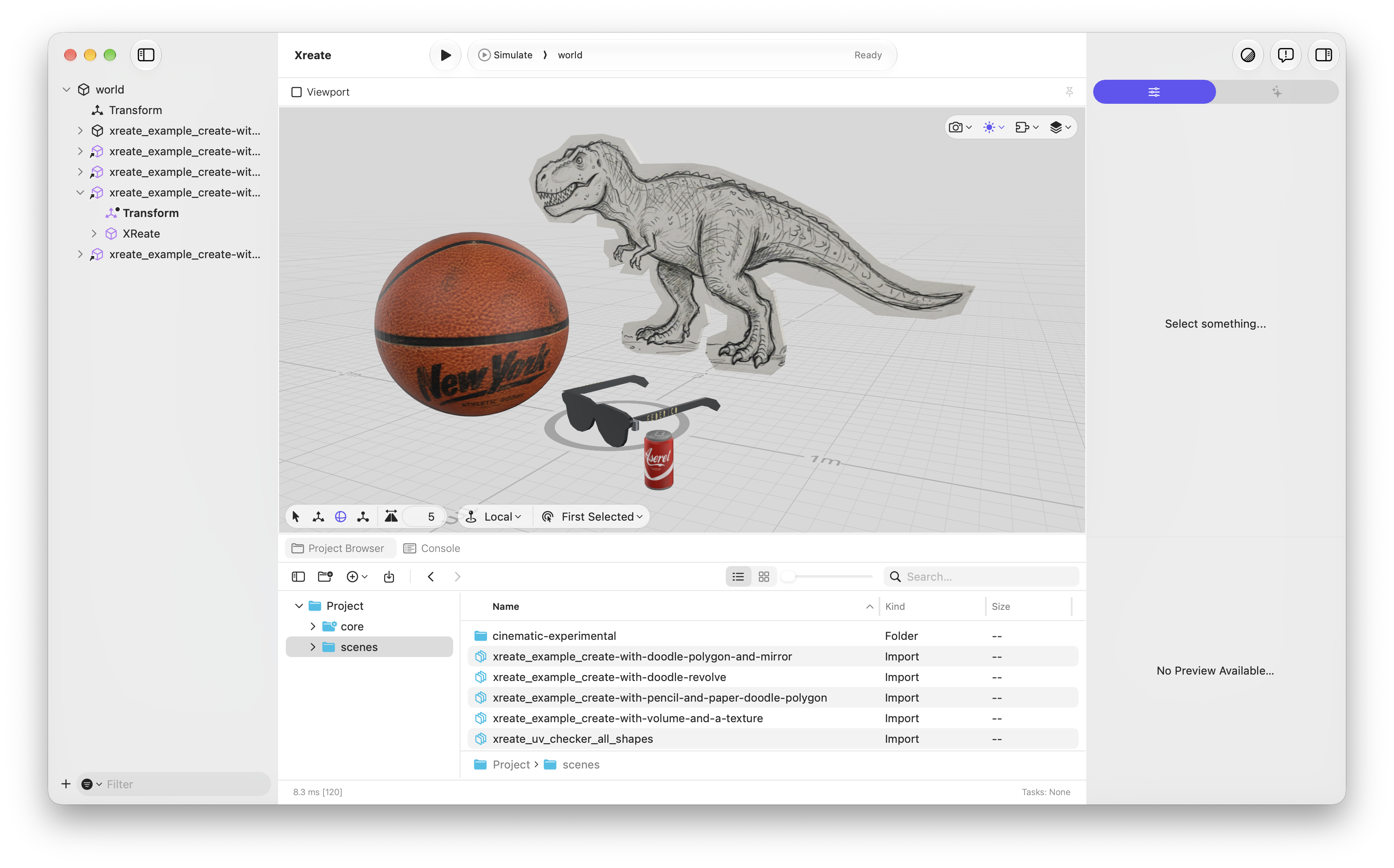
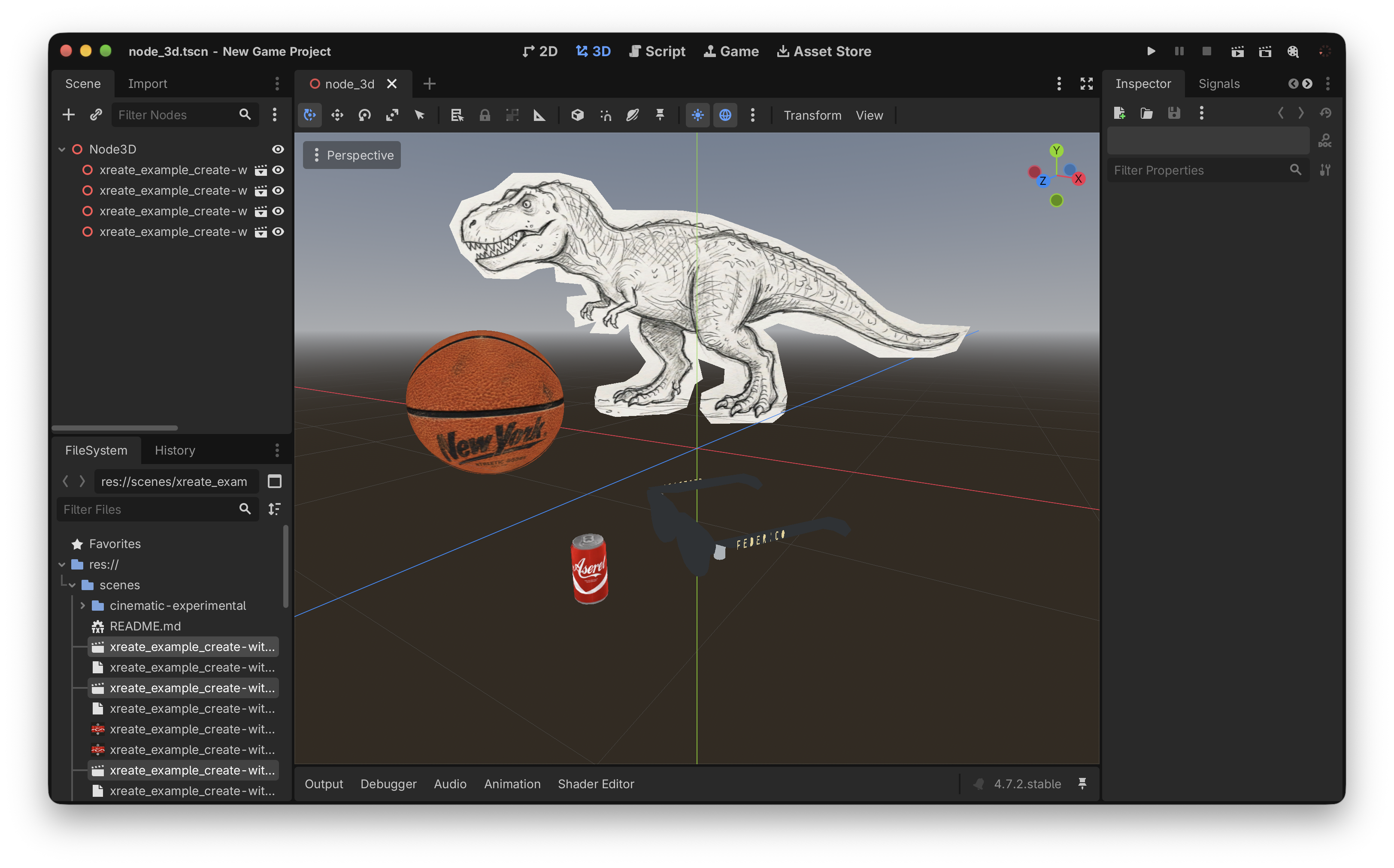
The export formats are where the prototype leaves the browser and enters someone else’s workflow: USDZ for Quick Look and Reality Composer Pro on Apple platforms, GLB for Godot, Blender, Three.js and any standards-compliant engine. Keeping the pipeline inside the browser removes the install, the account, and the format-conversion friction between a drawing and the next tool in the chain.
All geometry, textures, and scene data stay on the device. XReate is available for exploratory prototyping and teaching. Open XReate →
Personal project · Museum workshop · June 2026
Waraiguma · Bobin Maker · Colour into play
A playful colour tool created for children at Il Mare come Artigiano, Museo della Moda di Napoli. Colour a 3D yarn bobbin, collect palettes, and explore it in augmented reality.
- Learning through play
- Colour & perception
- 3D bobbins & AR
- No account required
- Open-source code (MIT)
How can a child explore colour through a digital object without first learning software? Bobin Maker was built by Francesco Perchiazzi over the 2 June weekend as a personal contribution to Il Mare come Artigiano, a workshop curated by Paola Maddaluno at the Museo della Moda di Napoli. Six-year-olds from the L’Orsa Maggiore co-operative explored colour, drawing, and weaving through activities inspired by Bruno Munari.
The yarn bobbin gives colour a familiar form: children can try combinations, save a palette, and place their creation in augmented reality. During the workshop, they began moving and scaling the bobbins, walking with them, and taking photographs in the museum garden. A tool for composing colours became a way to invent their own spatial games.
AI-assisted prototyping made it possible to build a small tool for this particular setting. The contribution involved choosing the metaphor, keeping the interactions immediate, and observing what the children made of them. The experience shows how a digital activity can connect with physical materials and leave room for discoveries beyond the original brief.
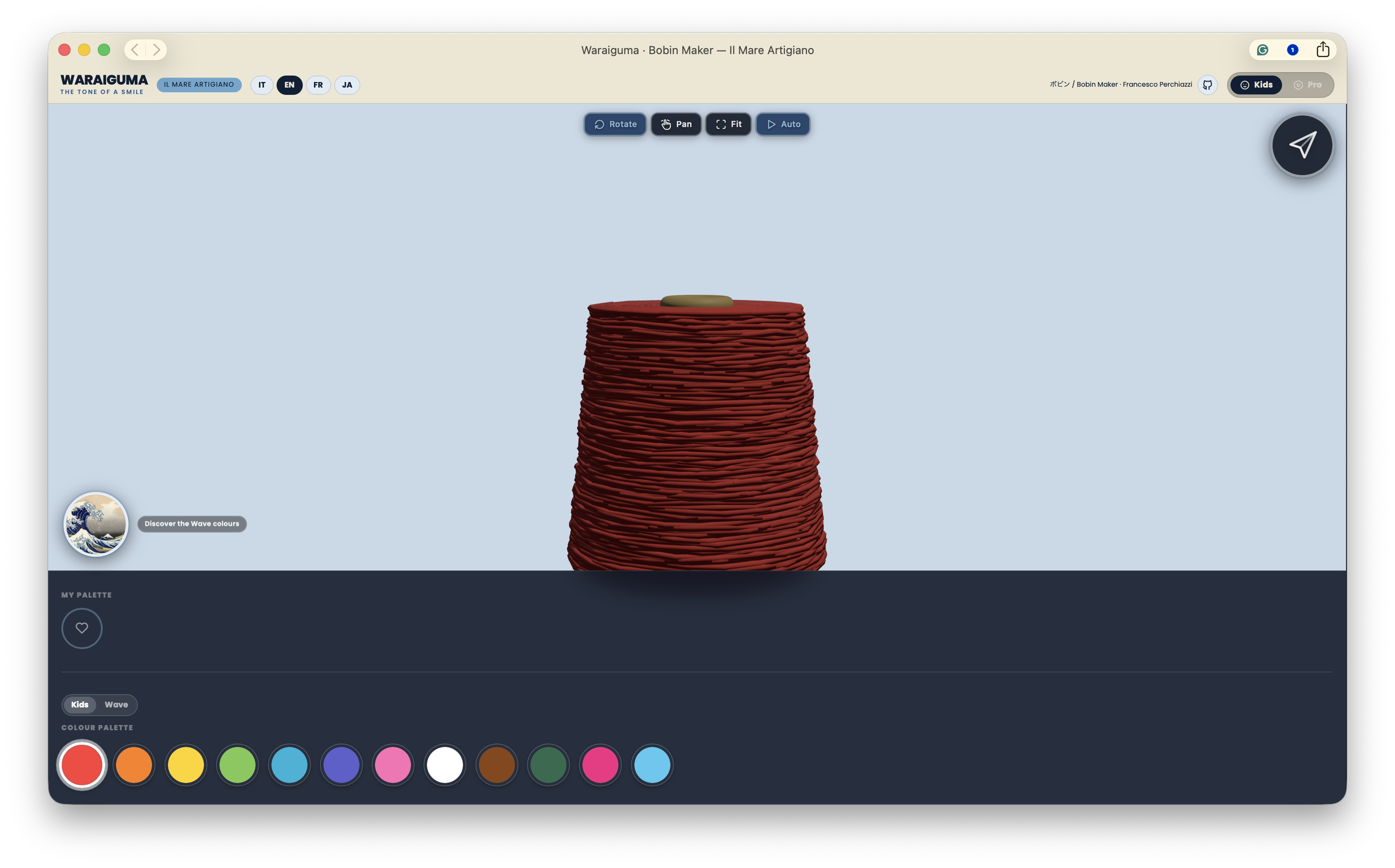
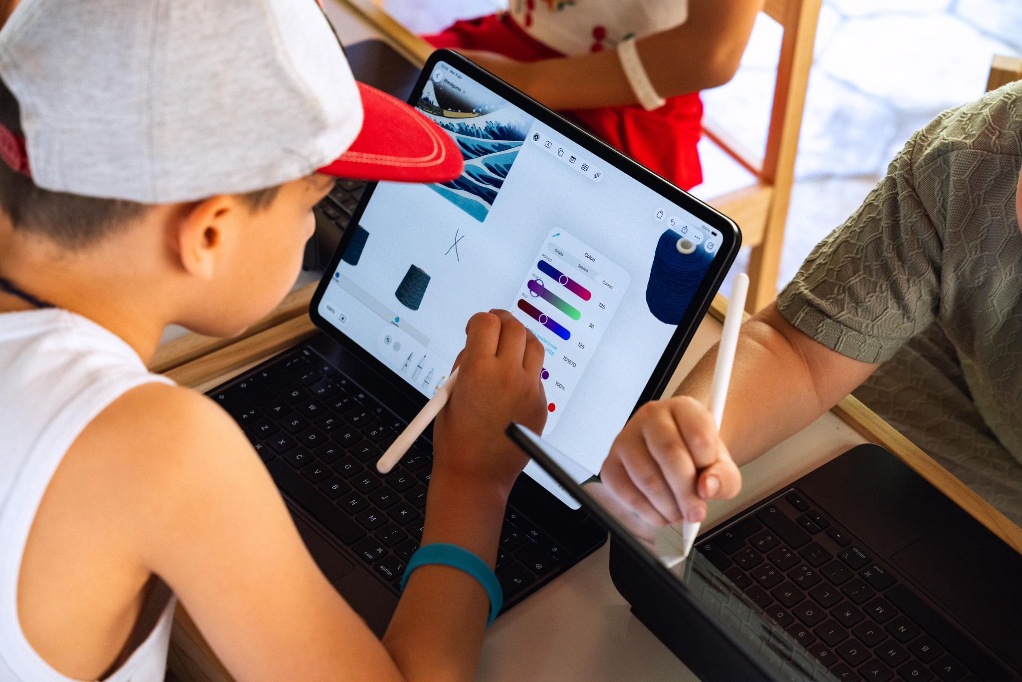
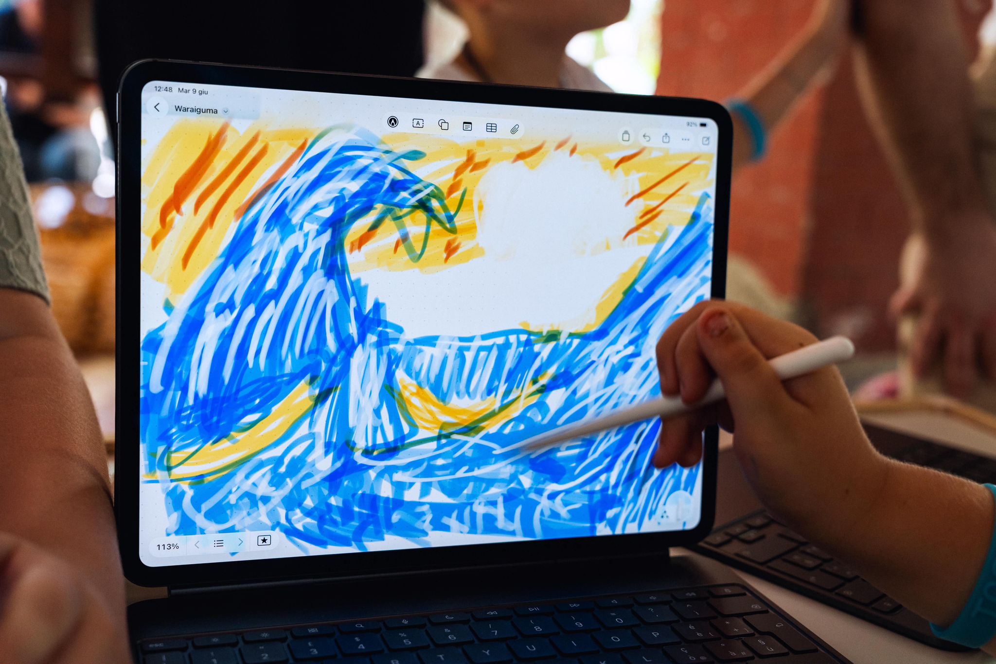
Drawing and discovering colour. The children moved between drawing on their iPads, exploring Hokusai’s Great Wave, and trying colours on a three-dimensional yarn bobbin. They sampled tones from the artwork, made their own marks, and compared combinations as they worked. The bobbin offered another way to explore the same colours: wrapped around a volume, alongside the yarn and materials of the workshop.
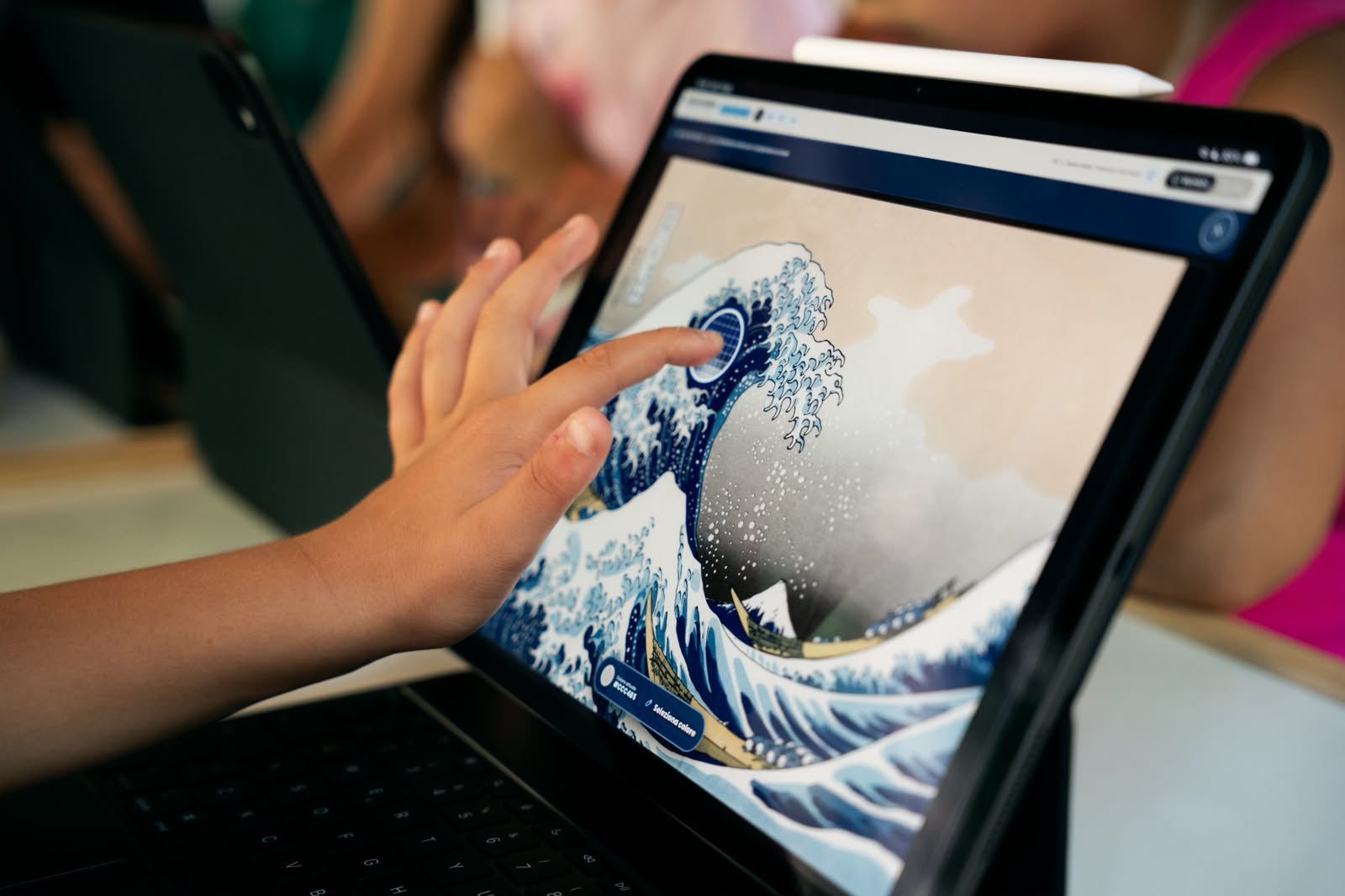
From digital bobbins to spatial play. After choosing colours and adjusting the shape of their bobbins, the children brought them into the museum through augmented reality. They moved and resized the digital objects, viewed them alongside real yarn and workshop materials, and explored the garden with their iPads. An activity that began with composing a palette became an opportunity to invent games with scale, placement, and movement.
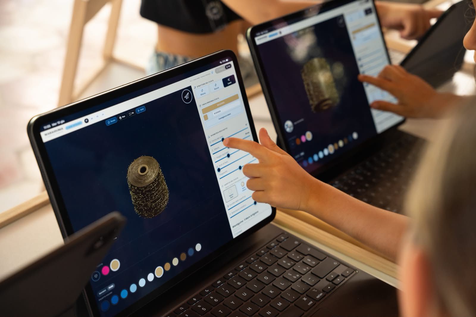
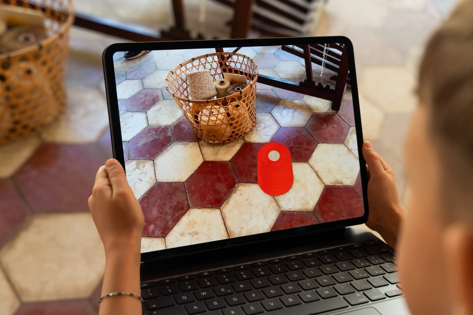

Il Mare come Artigiano · Museo della Moda di Napoli · June 2026. Curated by Paola Maddaluno, promoted by the Comune di Napoli in collaboration with L’Orsa Maggiore. Photographs © 2026 Marco Bernardini. All rights reserved.
Lecturing
Learning experiences connect visual foundations, games, and immersive computing through observation, experimentation, and independent judgement. Grounded in human factors and the Basic Design tradition of Ulm. Curricula and practical methods that students and fellow educators can carry into their own work.
Senior Mentor · Design, Immersive Experience, and Game Development
Apple Developer Academy, a partnership between the University of Naples Federico II and Apple · 2016 → present

From Apple.com
At the Academy the role involves developing and delivering advanced learning in immersive computing, combining perceptual science, human factors, and systematic thinking with hands-on prototyping. The goal is conceptual depth as well as technical fluency: practitioners who understand why they place things in space, not just how.
ARTE (Advanced Research Track Experience) is an applied research programme at the Apple Developer Academy in Naples, where students collaborate with researchers from Federico II on real-world problems. Its public presentation at Napoli Comicon 2026 explored the contribution of design to scientific research.
The role also carries responsibility for translating institutional complexity into coherent public outcomes: aligning the University of Naples Federico II, the Academy ecosystem, external research groups, and major cultural events into participation models that hold under live conditions. These responsibilities connect learning and experimentation with the demands of a live programme.
(A recent applied instance of this translation is documented in the Work section as a programme management and institutional coordination case study at Napoli Comicon 2026.)
Build the conditions.
Give learners ownership.The project belongs to whoever builds it. The contribution is iterative: framing the problem, reviewing direction at critical junctures, introducing the reference or constraint that reorients when work stalls, and stepping back when momentum is real.
This applies equally with university students and with experienced professionals in institutional or corporate contexts. The method scales with the quality of the conditions created, not the seniority of the participants. Three principles make this consistent rather than improvised:
- Rational decision-making.Every pedagogical and design choice is grounded in explicit, verifiable criteria. Not intuition, not the authority of the role.
- Radical trust.Students and collaborators receive real autonomy before they have demonstrated they deserve it. Trust is not a reward. It is the starting condition.
- Ecology of relationships.The care of external connections with institutions, practitioners, and researchers is integral to the educational process, not a parallel activity.
The aim is for learners to carry these habits into their next project: explain a decision, test it, and work independently with others.
This is what capability building means in practice here: not a single handover of knowledge, but a repeating cycle (frame, build, review, adjust, hand over ownership) applied again with the next problem, the next cohort, the next collaborator. The method is the product; the artefact is evidence that it worked.
Appointed through competitive public selection in 2016
(Public Notice iOS T1 04-016, Designer profile)
The mentoring role at the Academy, held since 2016, supports students as they develop ideas, build prototypes, and present their work. The teaching approach connects foundational principles with practical experimentation and collaboration.
The role began as part of the founding team of the iOS Developer Academy pilot program, the institution that later became Apple Developer Academy.
Game Design and Development Education
Learning activities connect player experience, visual communication, and prototyping. Exploring rules, feedback, and interaction helps participants explain and test what makes a game work.
Students and alumni share their games and interactive projects at public events, including Giffoni Good Games and Napoli Comicon. These occasions bring the work to audiences beyond the classroom.
Apple Foundation Programme · Design-Driven Track
Museo Nazionale di Capodimonte · Accademia di Belle Arti di Napoli · Accademia Aeronautica di Pozzuoli · 2019
A cross-institutional educational programme brought students from fine arts and military aeronautics into the Museo Nazionale di Capodimonte to explore app development in a cultural setting. The initiative was reported publicly in 2019.
The contribution focused on helping participants develop ideas that connected technology with the museum context. The experience brought different disciplines together through practical learning. Read more about the museum’s art and technology initiatives.
Adjunct Professor · Industrial Design, DiARC
University of Naples Federico II · 2024 → present
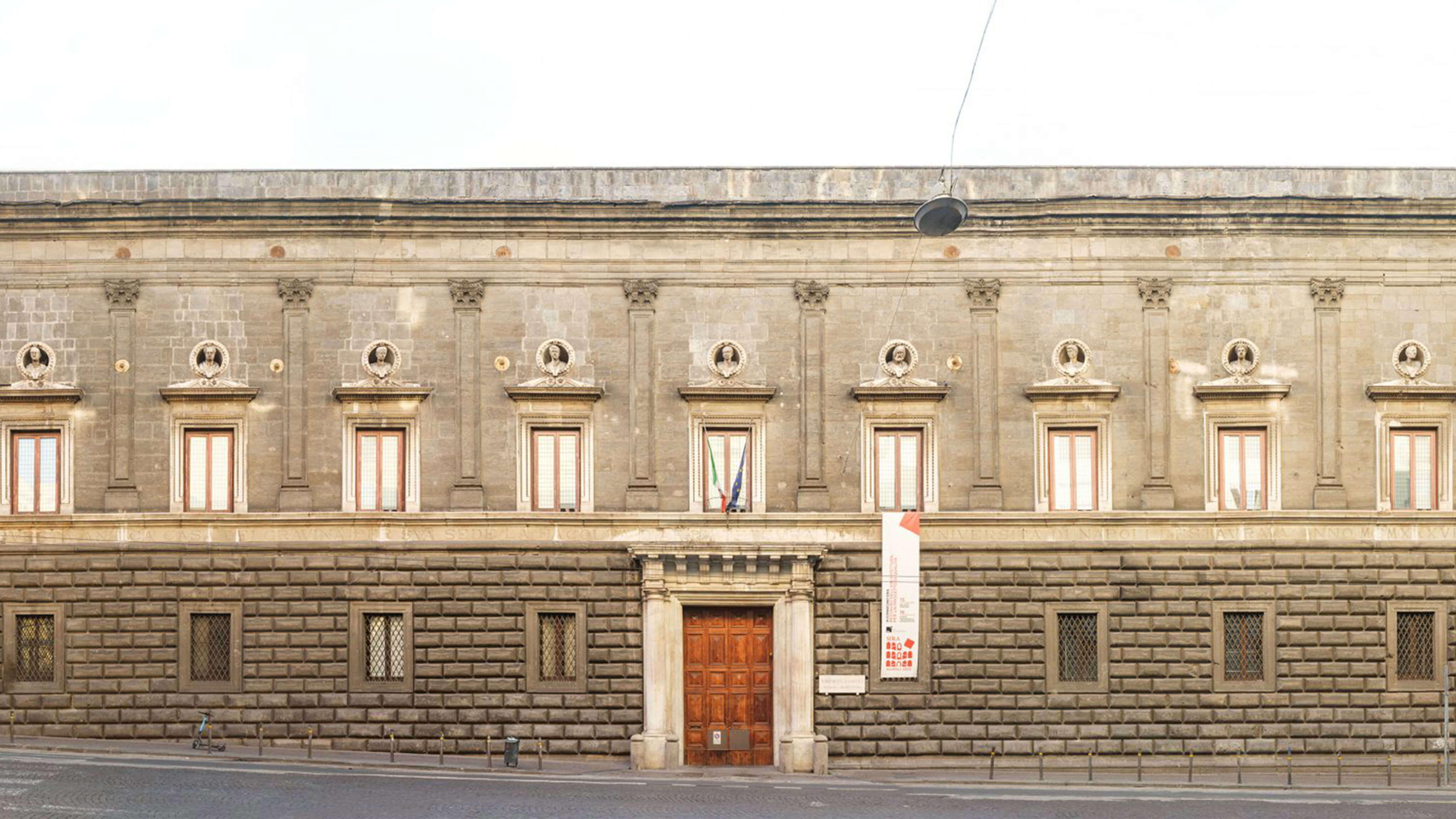
Graphic design courses are taught within the Community Design program at the Architecture Department (Scuola Politecnica e delle Scienze di Base), covering both foundational visual theory and applied practice under the ICAR/13 Industrial Design sector. Service also includes thesis supervision and membership of the graduation committee.
Graphic Design
Basic Design (U3430)
The course explores perception, Gestalt principles, affordances, and the form and use of products and environments. Students apply these foundations through typography, layout, grids, image-text relationships, and compositional hierarchies across different media. (ICAR/13 Industrial Design) Teaching language: Italian, 6 ECTS, 60 hours of lectures.
Graphic Design
Foundations of Technical Drawing (U3427)
Integrated with Methods and Techniques of Design Representation, the course connects visual communication with technical drawing standards. Students develop graphic and representational skills, working within aesthetic and technical requirements across media and industrial applications. (ICAR/13 Industrial Design) Teaching language: Italian, 6 ECTS, 60 hours of lectures.
Work
Selected projects span institutional infrastructure, passenger assistance, connected products, and XR. Each case brings different constraints and responsibilities into focus. Experimental frameworks and open tools are documented in the Research section.
| Date | Client | Domain | Outcome |
|---|---|---|---|
| 2026 | Napoli Comicon | Institutional Program & Event Design | Apple Developer Academy at Comicon 2026. Multi-institution XR and game culture program involving exhibition systems, public engagement, and operational coordination throughout the public festival. |
| 2020 | GE.S.A.C | Inclusive Service Design | PRM Inclusive Service Design. Three-role operational coordination suite supporting accessibility and passenger assistance workflows across Naples and Salerno Airports. |
| 2019 | Atellani LLC | IoT Product Ecosystem | Brid Smart Air Purifier. Cross-device interaction and monitoring system for connected air-quality management. |
| 2014 | Abracapp Limited | Social & Community Platform | Abracapp. Hyperlocal storytelling platform focused on community engagement and location-based interaction. |
| 2011 | Poste Italiane | Research & Service Infrastructure | MIUR NOP 0102136 · TITAN. Unified smart-card ecosystem integrating physical and digital public-service channels. |
| 2009 | Heineken Italia | Speculative Interaction Design | Driveken App. Augmented reality campaign exploring behavioural awareness and anti-drunk-driving engagement. |
Apple Developer Academy at Napoli Comicon 2026
University of Naples Federico II · Visiona Soc. Coop. · 2026 · Event Design
| Challenge | Methodology | Outcome |
|---|---|---|
| Coordinating the Apple Developer Academy ecosystem presence at Napoli Comicon 2026 across institutional stakeholders, public engagement, logistics, and live operations. | Connected the public booth and the ARTE panel through a programme bringing together game design, research, and audience participation. | Public game demonstrations, conversations with visitors, and an ARTE panel presenting collaborations between Academy students and Federico II researchers. |
The participation at Napoli Comicon 2026 extended beyond event organisation. It involved designing a public participation framework capable of operating across institutional complexity, live unpredictability, and continuous audience interaction.
The public booth hosted Studio26, a collective of Apple Developer Academy alumni, presenting interactive multiplayer experiences and live demonstrations. Students and alumni shared their projects with festival visitors through live demonstrations and hands-on play.
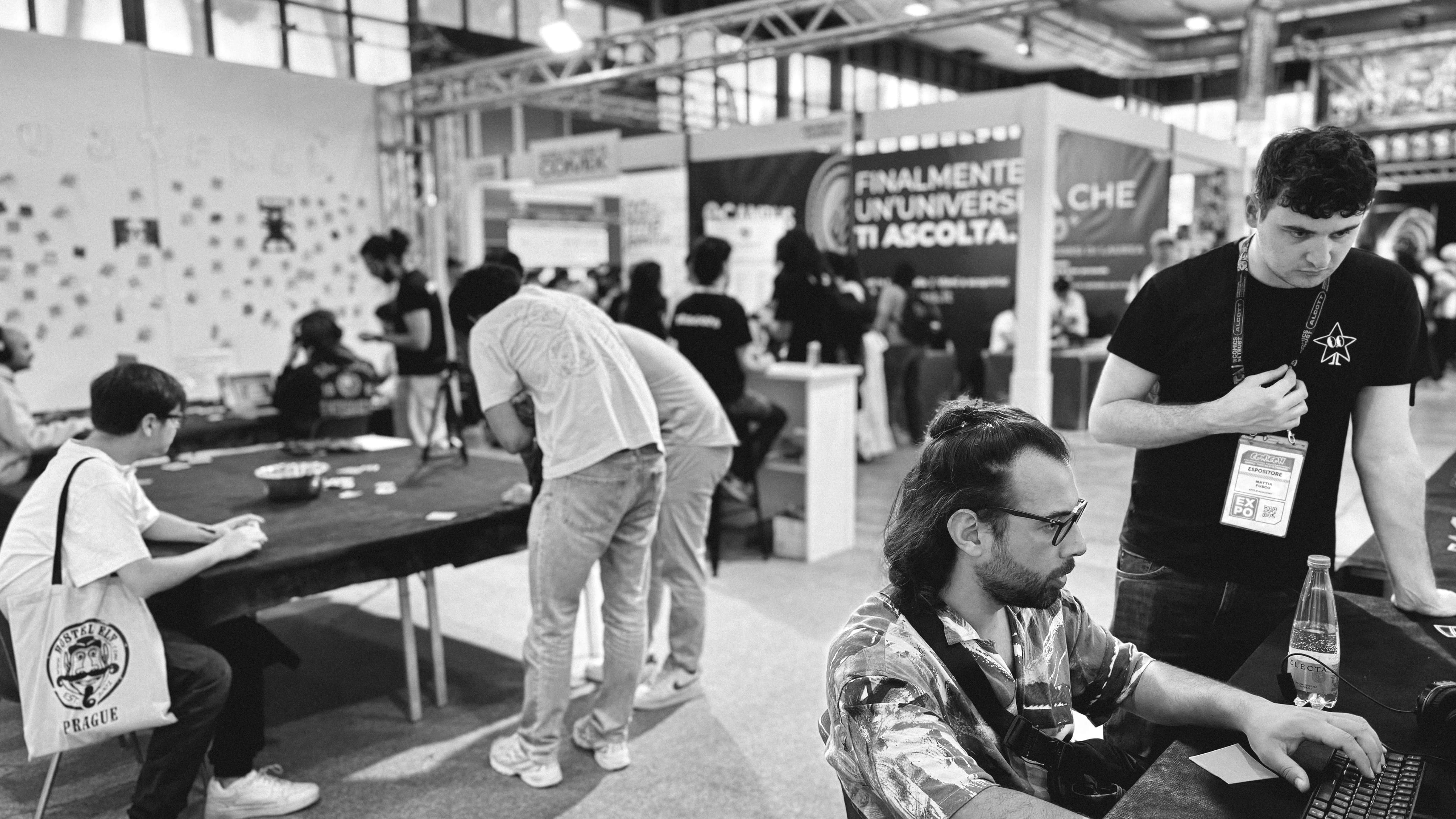
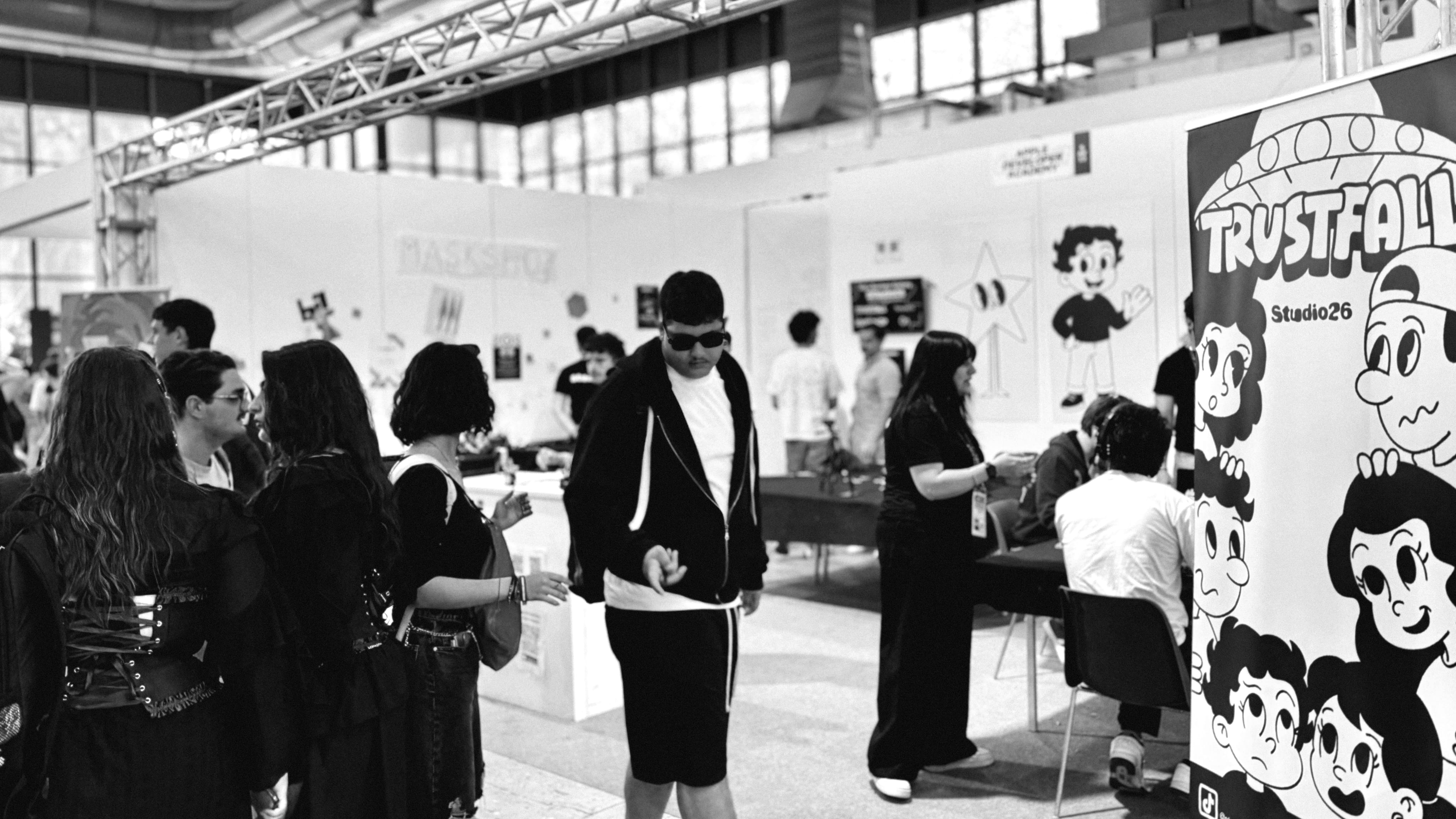
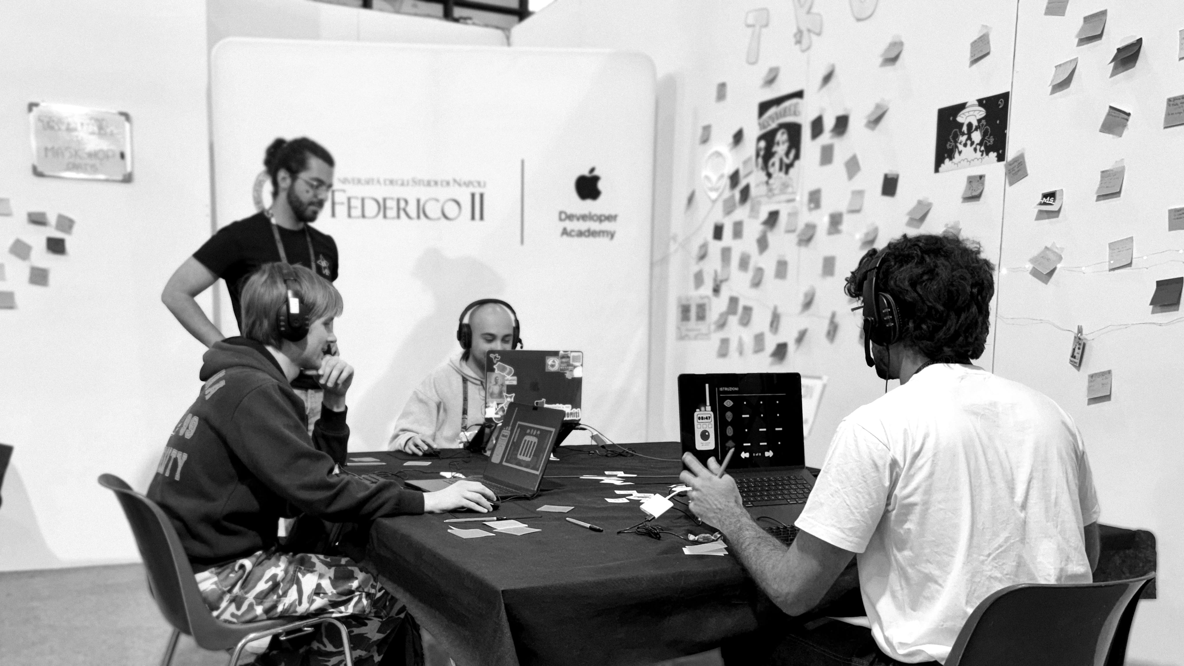
The ARTE panel on the HyperStage on 3 May brought students, doctoral candidates, and faculty from Federico II into a conversation with festival visitors about their collaborative investigations.
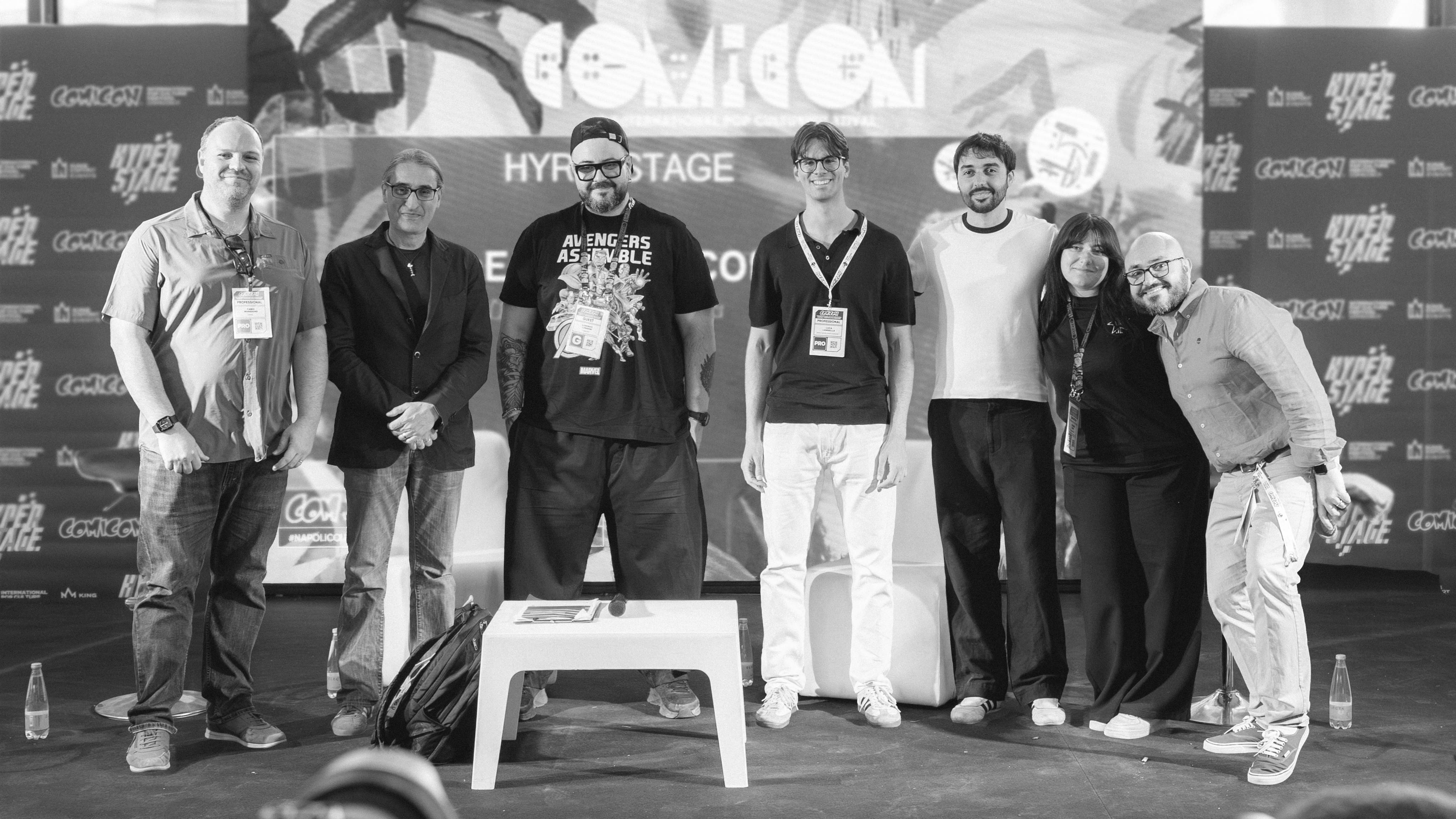
Programme management connected the Apple ecosystem, Federico II, Comicon, alumni networks, and academic teams, keeping exhibition, communication, and live participant experience coherent under four consecutive days of public pressure. Visit Napoli Comicon →
Person with Reduced Mobility (PRM) Inclusive Service Design
Naples Salerno Airports GE.S.A.C · 2020 · Android 11
| Challenge | Methodology | Outcome |
|---|---|---|
| Coordination gaps between Coordinators, Field Operators, and Transportation Drivers hindered passenger assistance workflows, reducing service quality and operational efficiency. | Field observation and stakeholder interviews informed the approach. Daily tasks and role-specific needs shaped navigation and operational flows. | Three integrated platforms optimised for distinct operational roles, a coordination dashboard, a field operator interface, and a mobile driver app. |
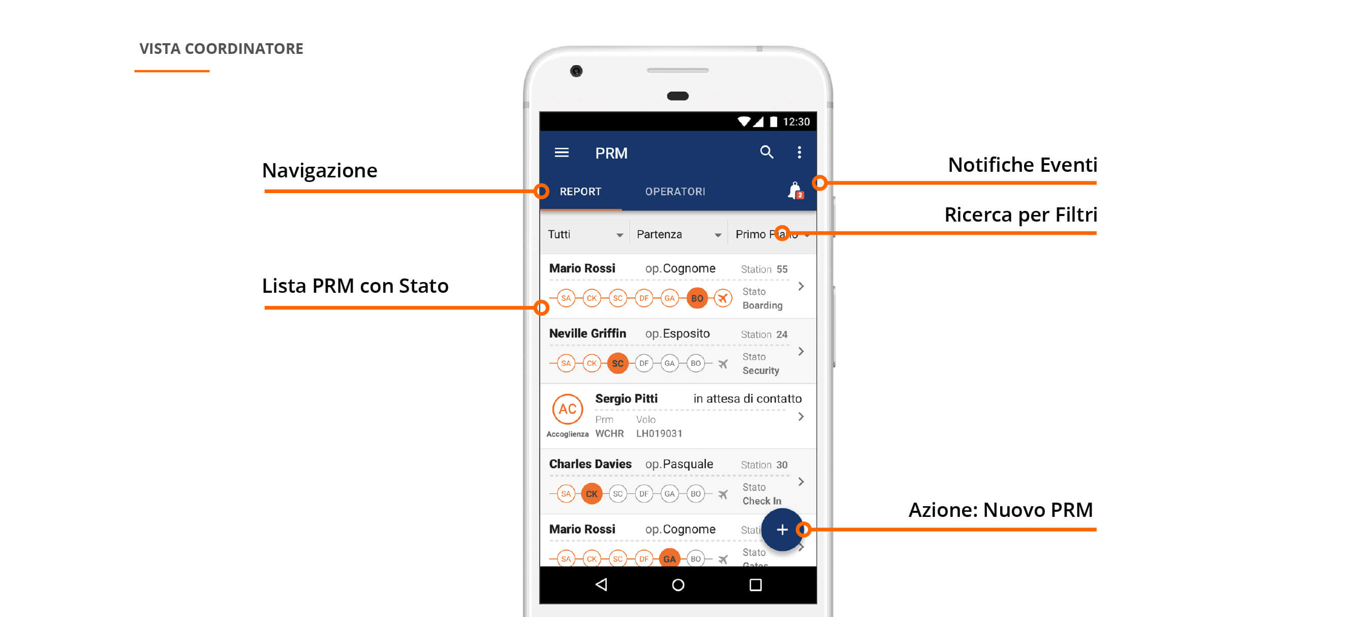
PRM Manager was developed to optimise assistance services for passengers with reduced mobility (PRMs) at Naples and Salerno airports. Focused on usability and operational clarity, the system coordinates ground staff, airline personnel, and service providers to deliver consistent, respectful support throughout the travel experience.
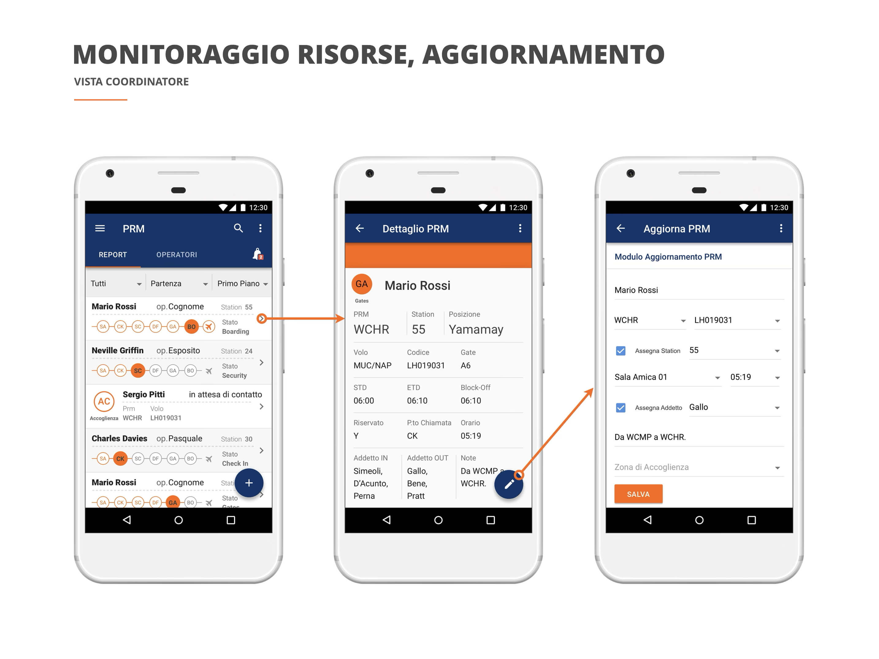
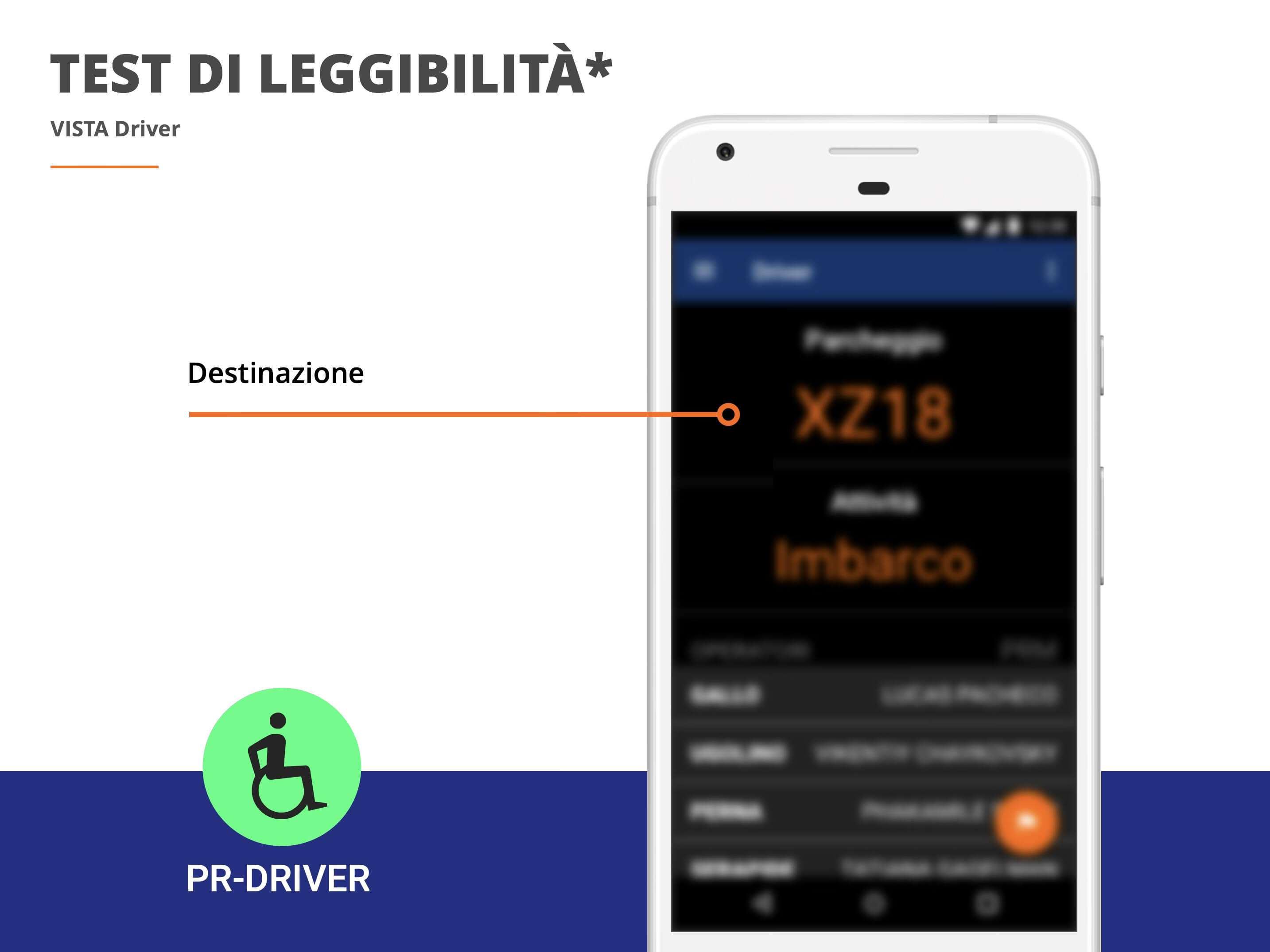
The project applies service design methodology to improve collaboration across roles and streamline passenger support. It includes real-time coordination tools, predictive scheduling based on historical data, and monitoring systems to ensure accessibility compliance. Interfaces are designed for speed, clarity, and traceability, enabling staff to manage requests effectively and maintain high-quality service records.
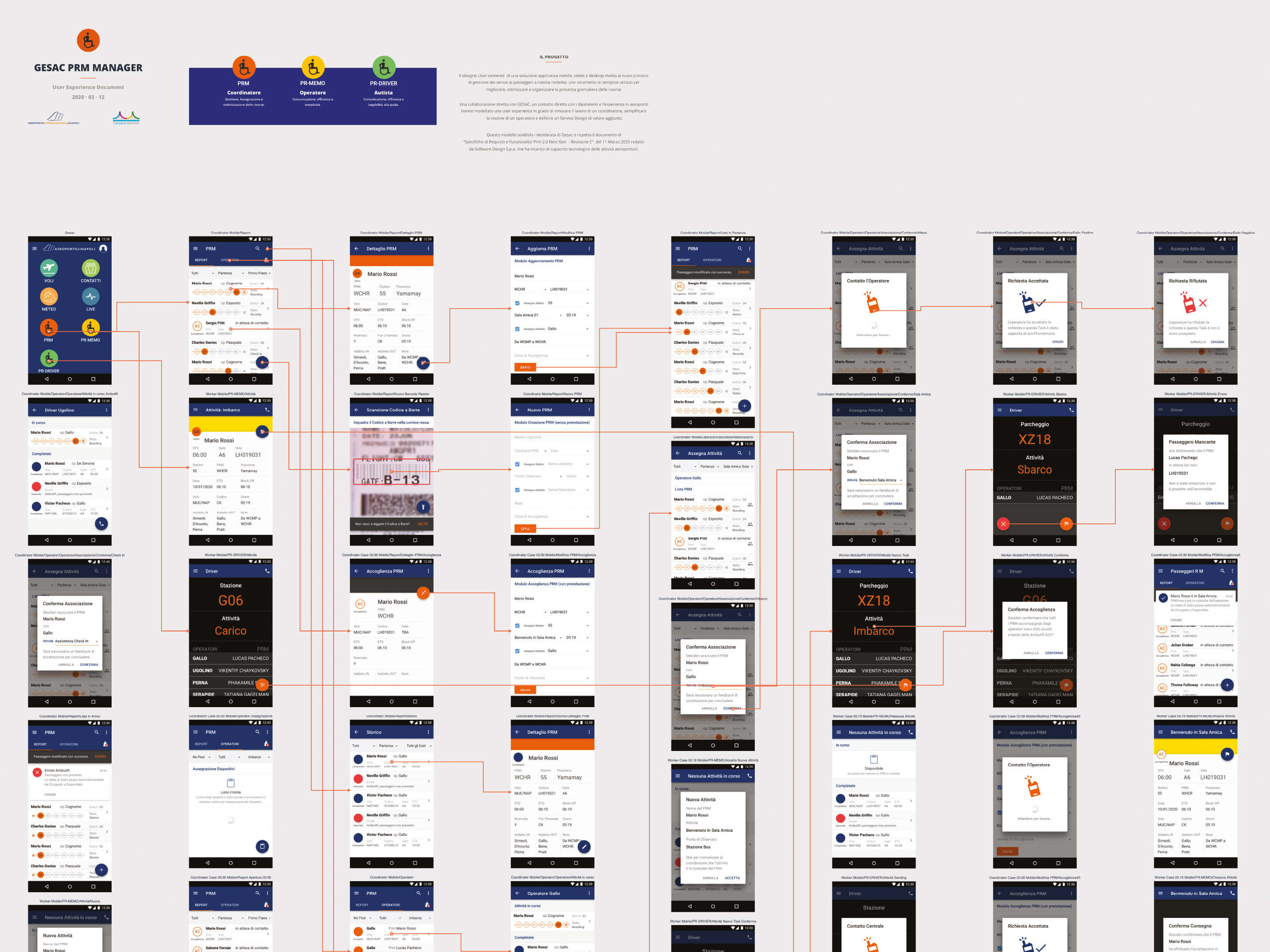
PRM Manager aligns with the Charter of Fundamental Rights of the European Union, reinforcing the right to equal access, mobility, and non-discrimination. Its inclusive design supports passengers with reduced mobility through every touchpoint, upholding dignity and full accessibility. Learn more about GE.S.A.C passenger assistance services →
Brid Smart Air Purifier
Atellani LLC · 2019 · iOS 13, watchOS 7
| Challenge | Methodology | Outcome |
|---|---|---|
| Create a cohesive, user-centred experience for BRID’s smart air purifier across iPhone, iPad, and Apple Watch, balancing advanced features with simplicity across different devices. | Contribution: a consistent visual system and navigation across devices, with fuller controls on iPhone and iPad and quick-access interactions on Apple Watch. | Screens for monitoring and controlling the purifier across iPhone, iPad, and Apple Watch, illustrated below. No measured improvement in usability is claimed. |
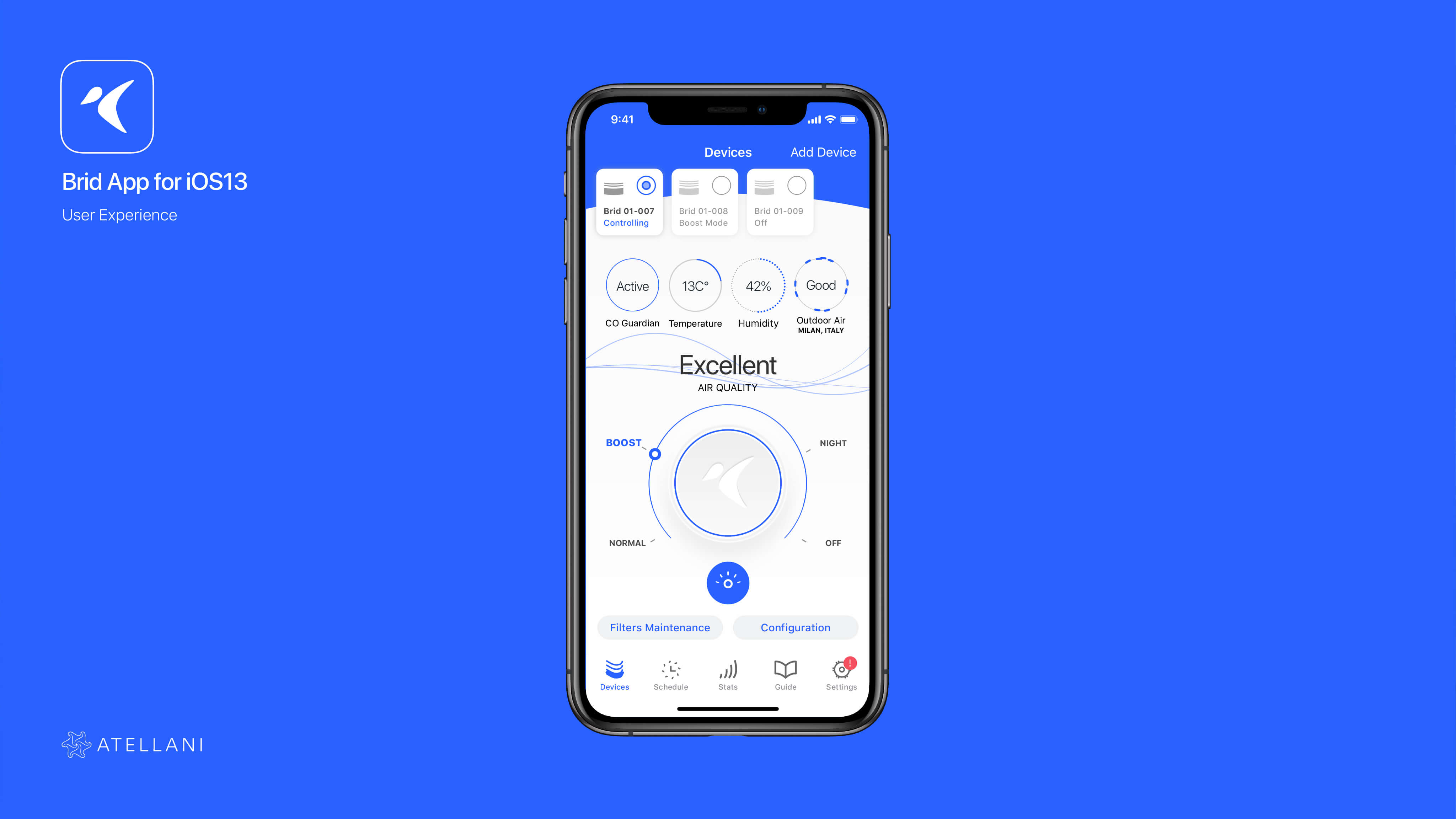
The Brid App was designed to offer an intuitive experience across iOS, iPadOS, and watchOS. Grounded in usability, performance, and clarity, the interface supports responsive gestures, consistent navigation, and clear visual feedback. Users can monitor air quality, adjust settings, and receive real-time updates.
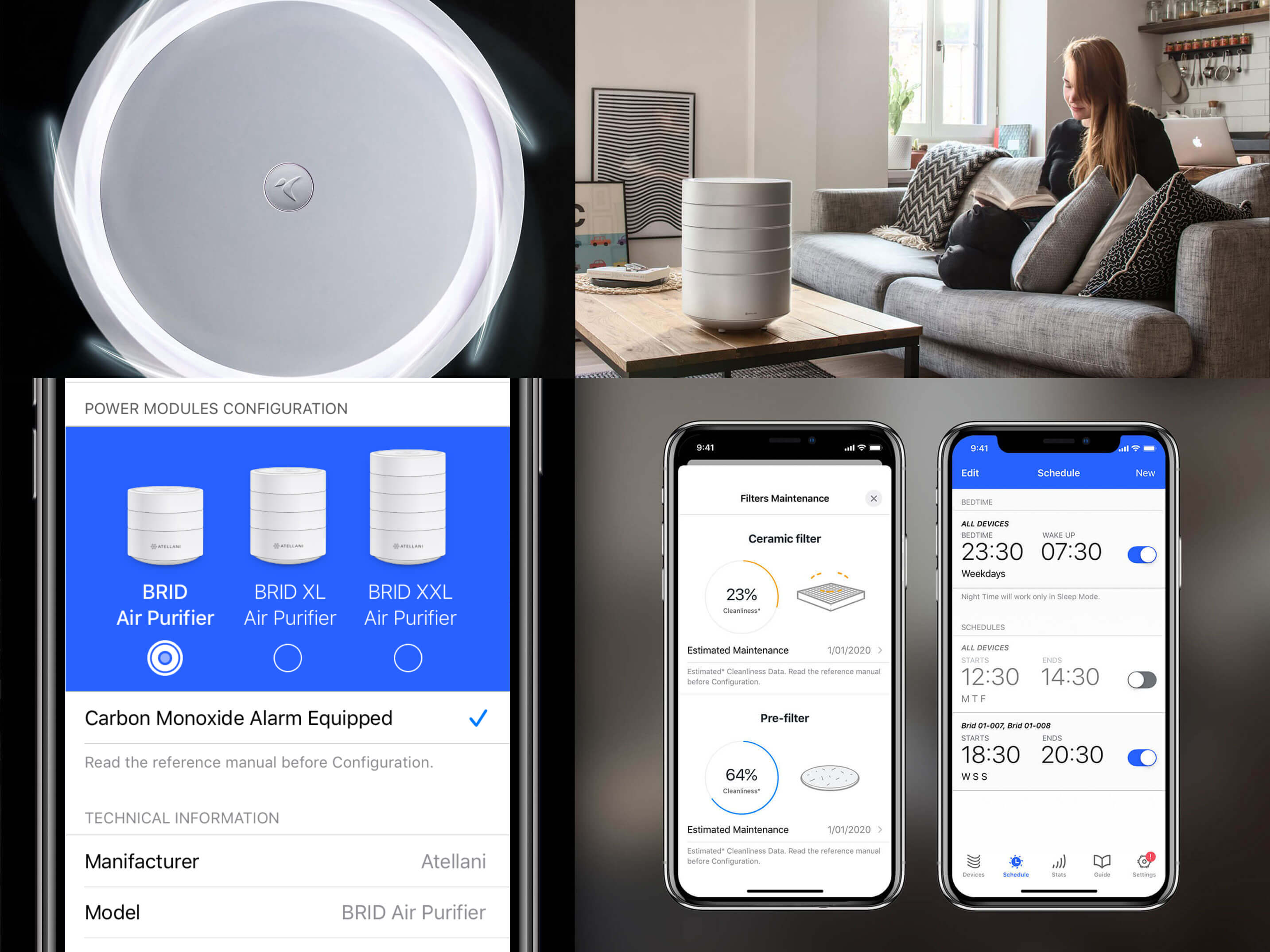
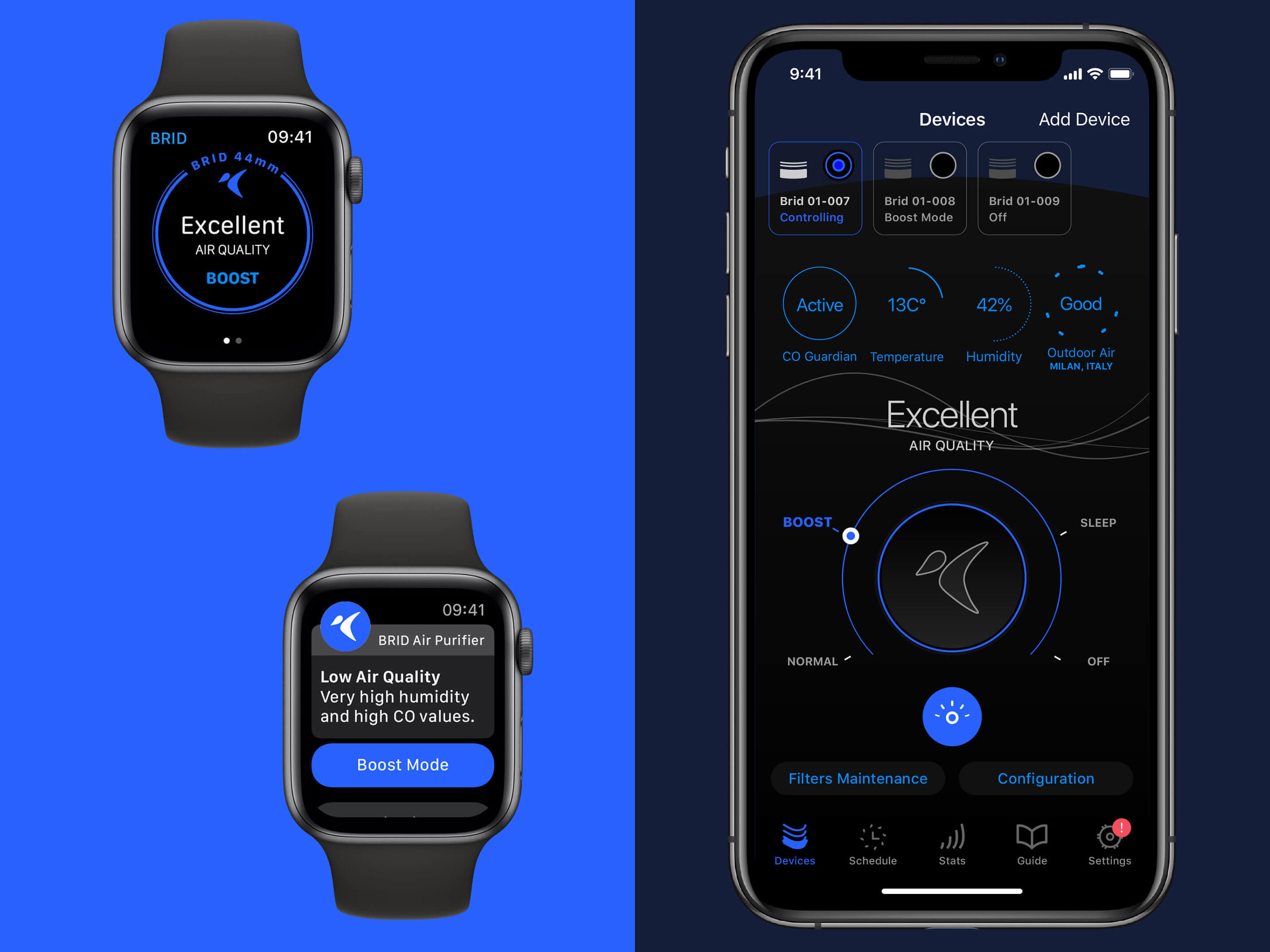
The app simplifies the management of indoor air quality through visual indicators, adaptive notifications, and energy-efficient controls tailored to daily patterns and user preferences. Data is presented clearly, making even complex environmental metrics easy to interpret and act upon.
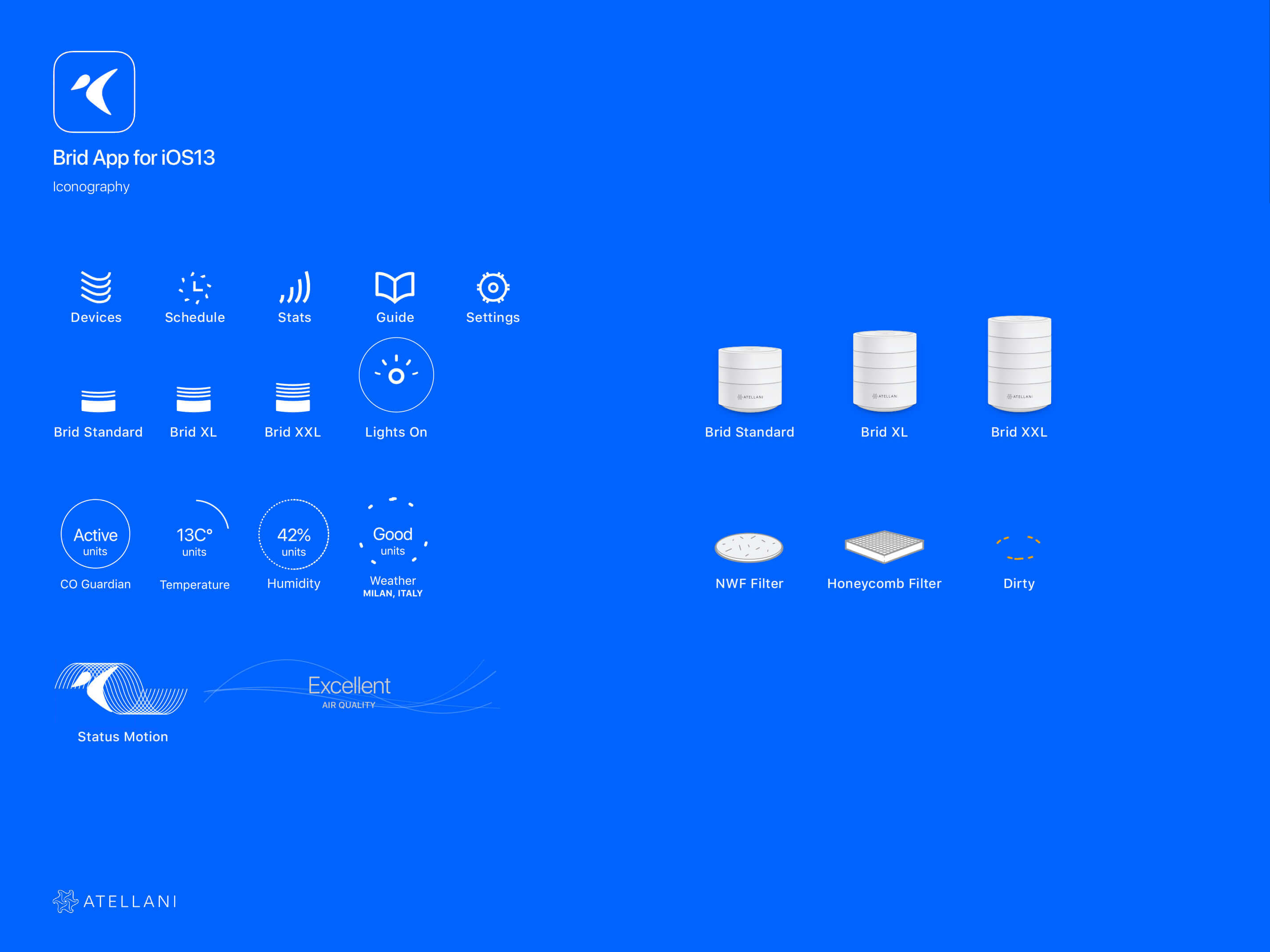

As the purifier’s digital companion, the app presents product information and controls suited to each screen size. Discover BRID Air Purifier →
Abracapp
Abracapp Limited · 2014 · iOS 8
| Challenge | Methodology | Outcome |
|---|---|---|
| Local communities lacked a digital tool to connect neighbors, welcome newcomers, and share everyday stories tied to specific places. Existing platforms didn’t support authentic, location-based engagement at the neighbourhood level. | Designed a location-aware app with tagged posts, adjustable range, multilingual input, and community messaging, centred on storytelling and local relevance, without user profiles or generic feeds. | Abracapp fostered connection through hyperlocal stories, tips, and campaigns. It strengthened digital ties within physical communities and gave users a platform to engage meaningfully with their surroundings. |
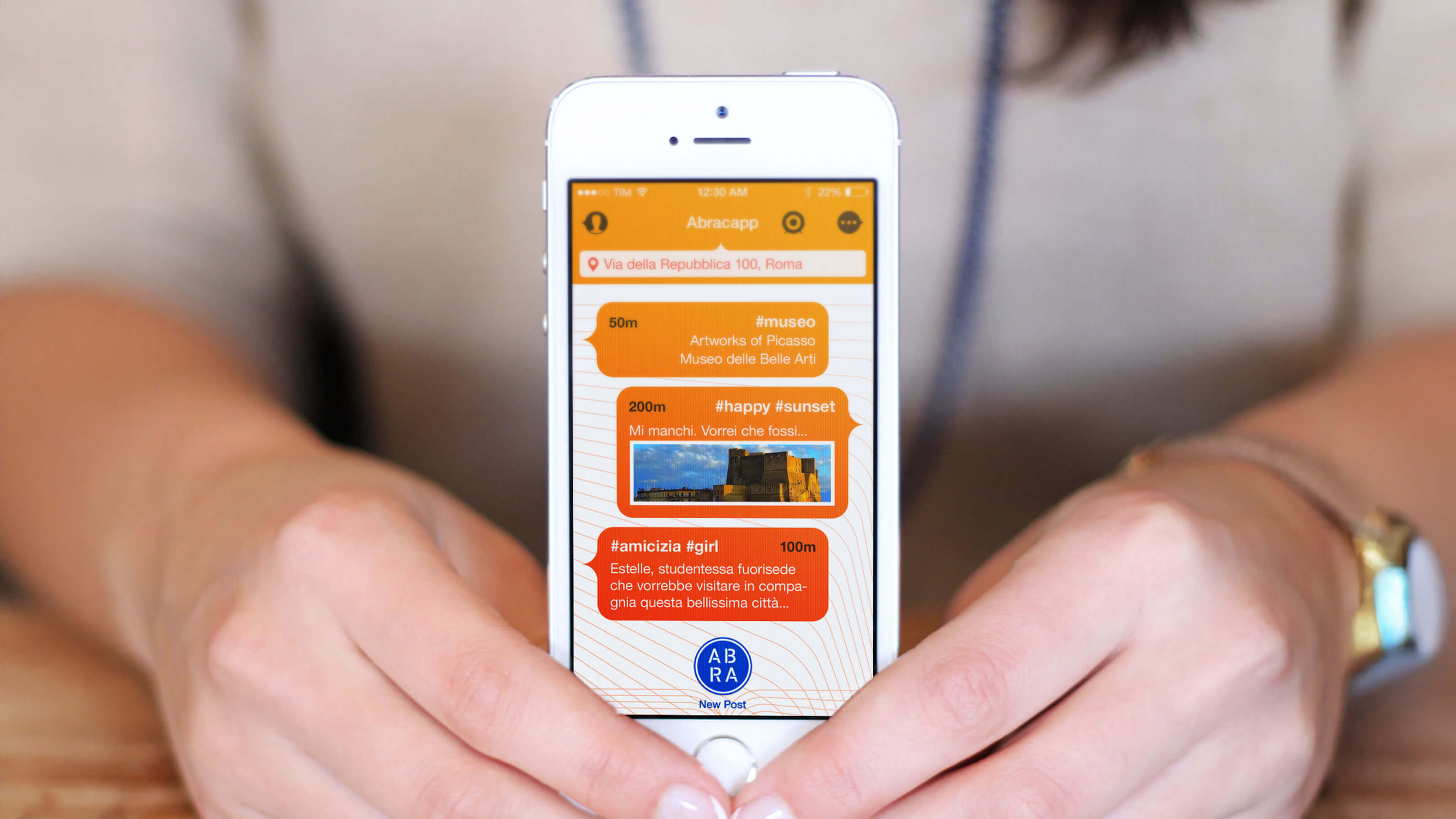
Abracapp offers a fresh approach to location-based social interaction by turning physical spaces into shared storytelling platforms. Unlike traditional social networks, it removes user profiles and friend lists, placing the focus on places and the stories they inspire. The result is a more genuine, discovery-driven experience that values community over individual branding.
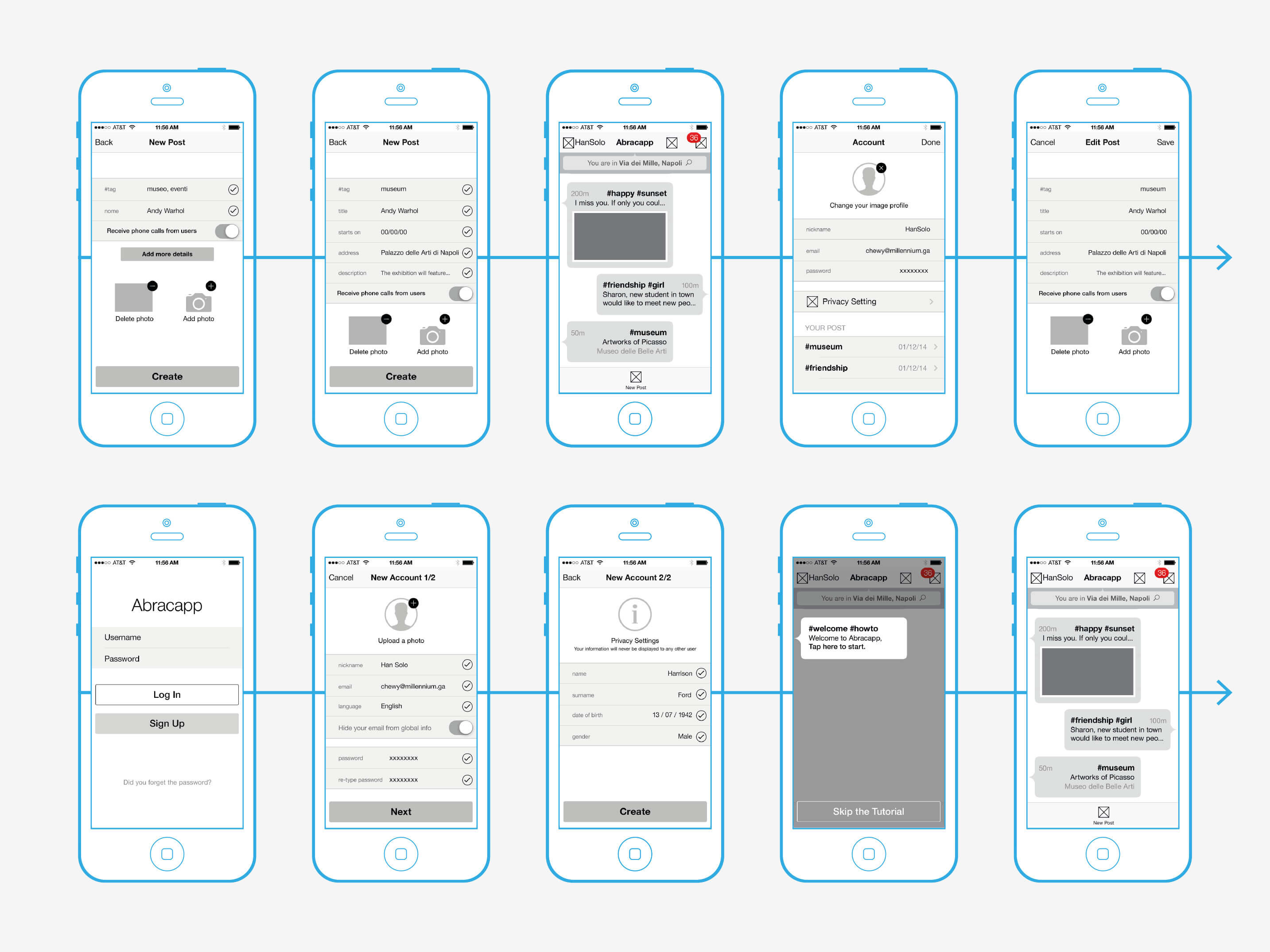
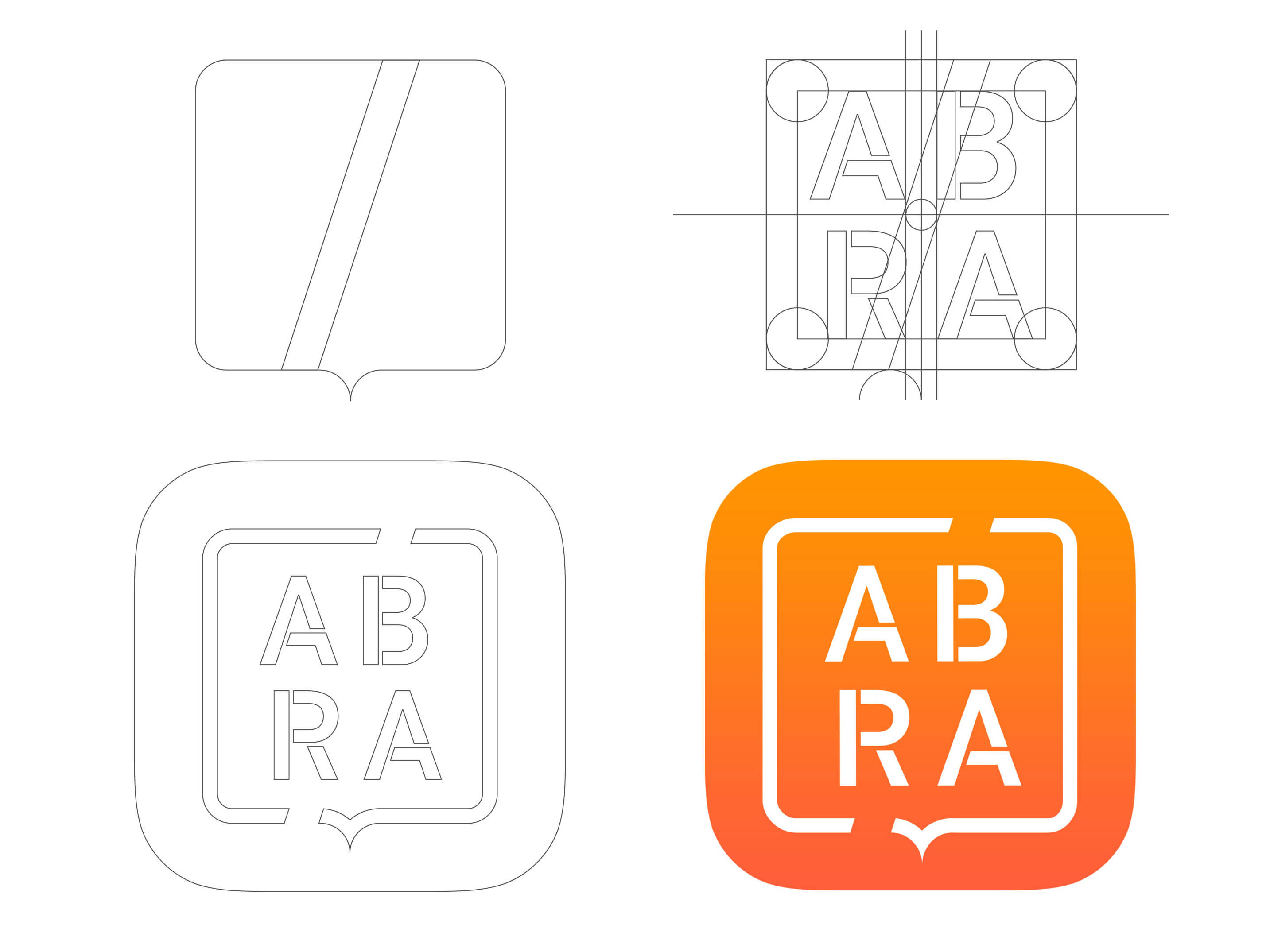
From streets to neighbourhoods, users can tag places with thoughts, events, and shared memories, building a living archive of local experience. Whether exploring new cities or connecting within familiar spaces, Abracapp creates authentic bonds through place-based storytelling, without the filters of curated identity.
Free and open to all, Abracapp invites users to share ideas, discover local gems, and engage with a dynamic network of stories rooted in real environments. Learn more about Abracapp Limited →
MIUR NOP 0102136 · Titan
University of Salerno, in partnership with Poste Italiane · 2011 to 2015
· iOS 7, Android 4, Windows Phone 8, Intranet Microsoft Internet Explorer (IE) 7
Research context: Funded under the Italian National Operational program for Research and Competitiveness (PON R&C 2007 to 2013), MIUR grant NOP 0102136. Institutional research project, not client work.
| Challenge | Methodology | Outcome |
|---|---|---|
| The rise of digital payments demanded more than fragmented apps and isolated services. The challenge was to create a single ecosystem where money, mobility, utilities, and loyalty programs could converge, accessible through mobile devices, intranet, POS terminals, and ATMs. | The project mapped the entire lifecycle of digital value, from issuance to everyday use, designing cross-platform interfaces that made complex infrastructures legible. The process combined service design, geolocated engagement, and real-time monitoring to ensure both human-centred usability and institutional scalability. | The project explored a unified smart-card concept connecting payments, transport, and services across physical and digital touchpoints. The work shown here documents interface and service concepts developed within that research context; it does not establish subsequent adoption or influence on other programmes. |
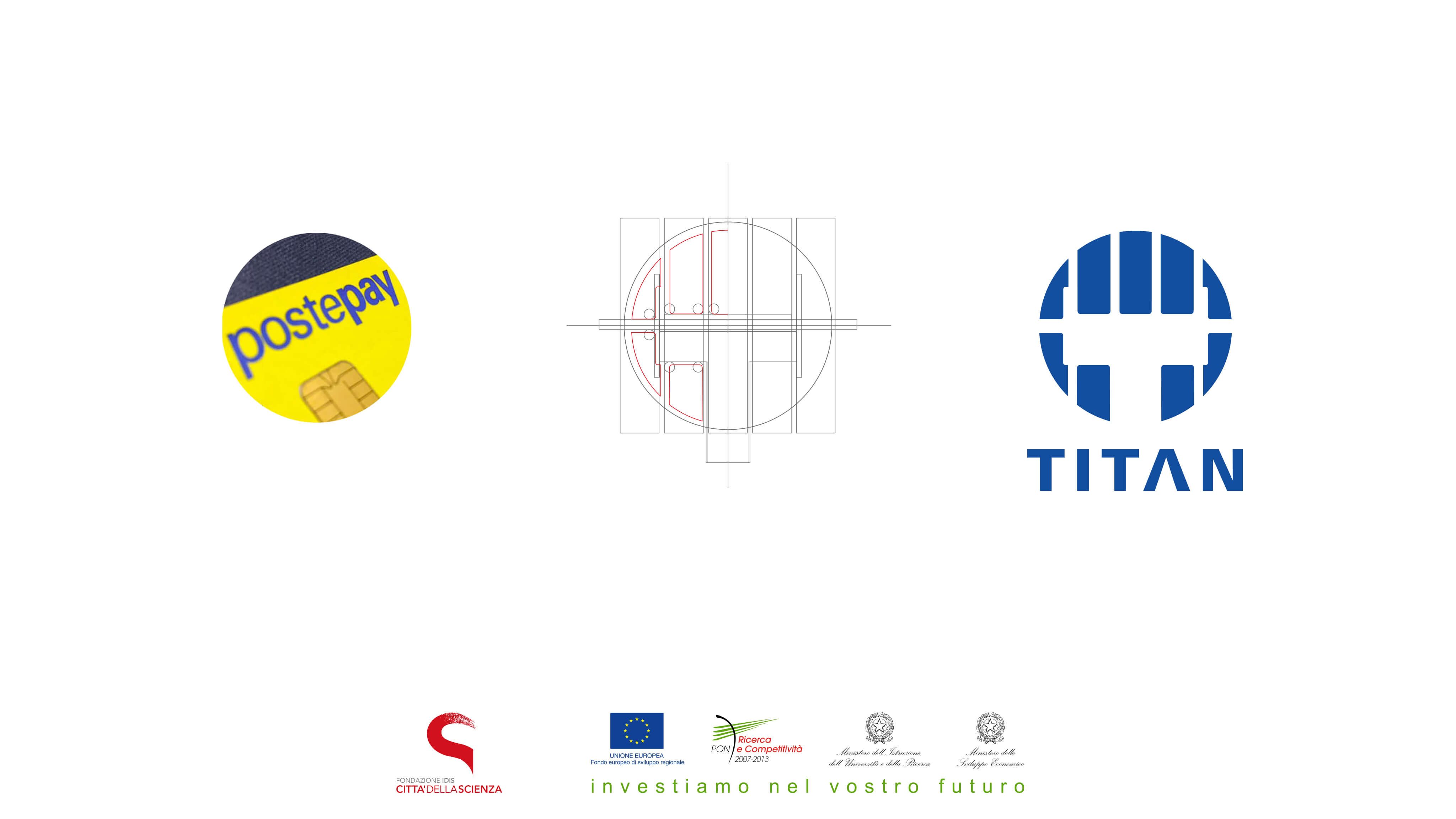
TITAN was a five-year investigation into electronic money and multi-channel access. Proposals covered iOS, Android, Windows Phone, and intranet systems, exploring how payments, loyalty, and public utilities could work together.
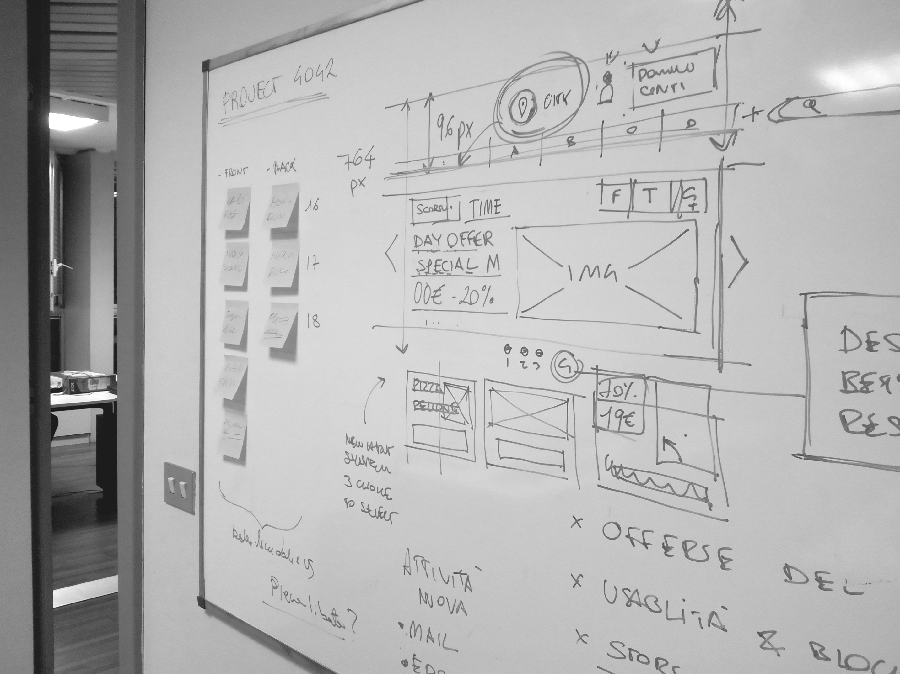
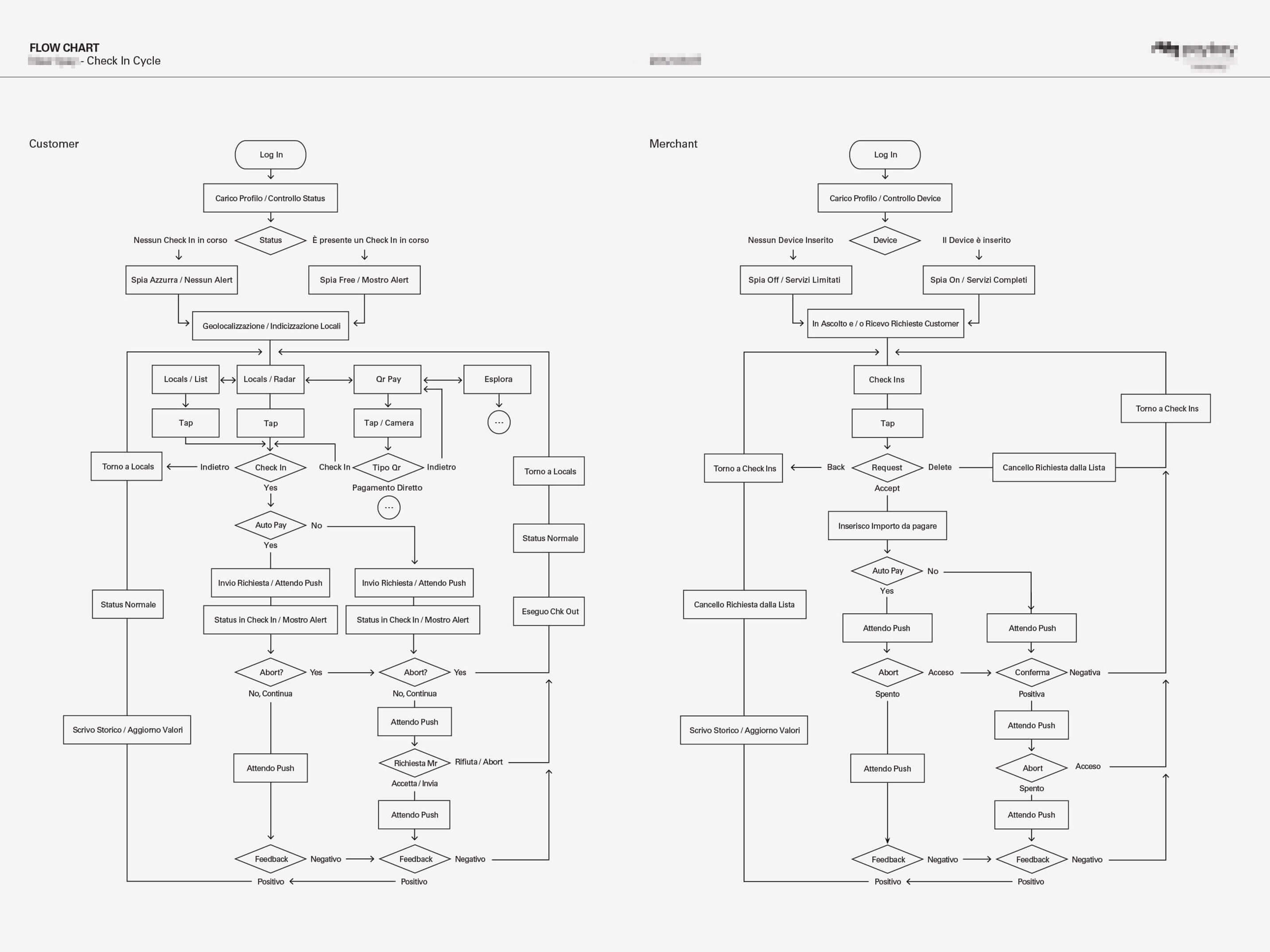
The system translated the technical lifecycle of digital transactions into everyday clarity, supporting payments, mobility, billing, and loyalty schemes. Each channel was designed for continuity, embedding trust, security, and compliance as invisible layers beneath a consistent, legible user experience.
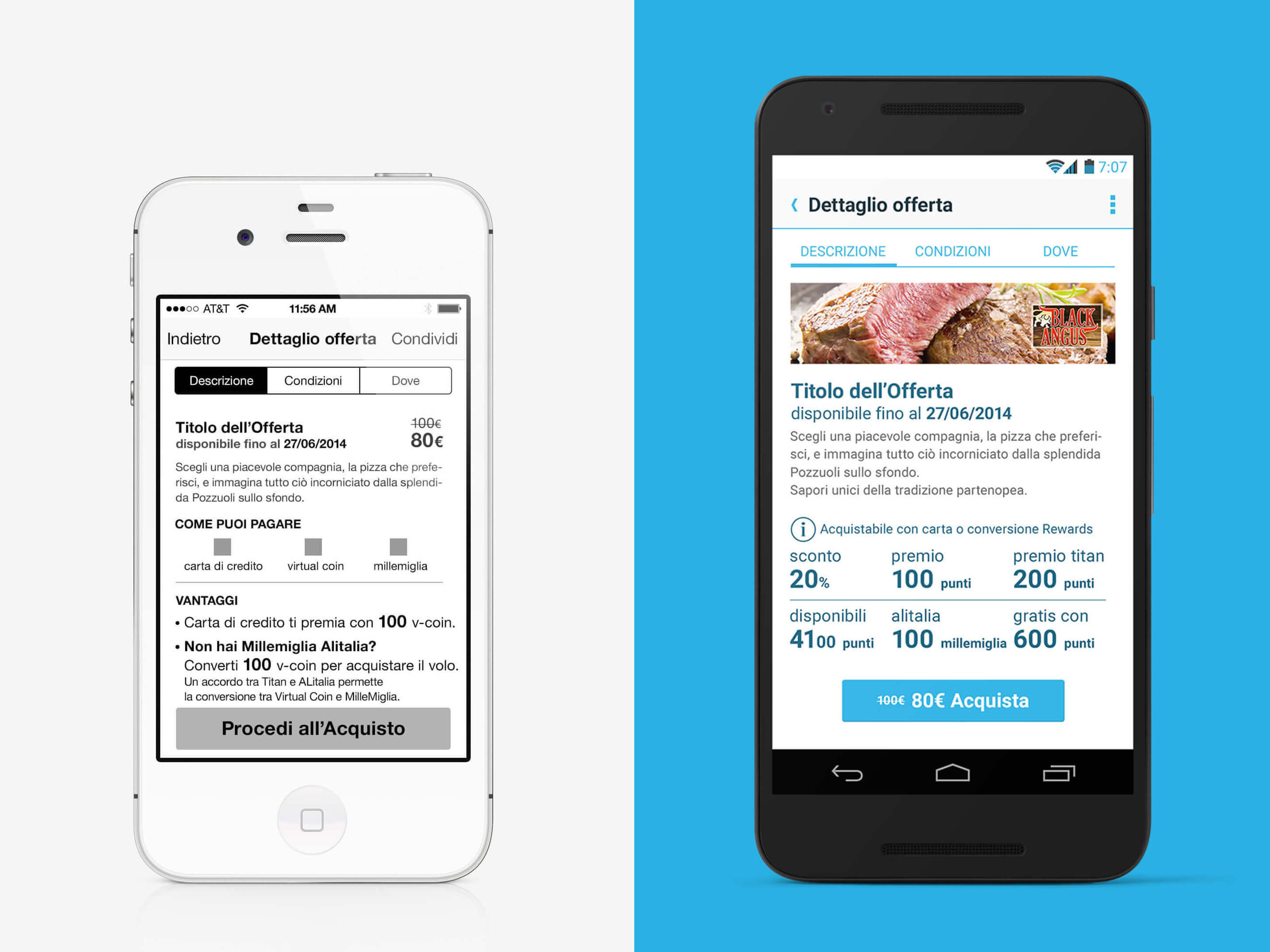
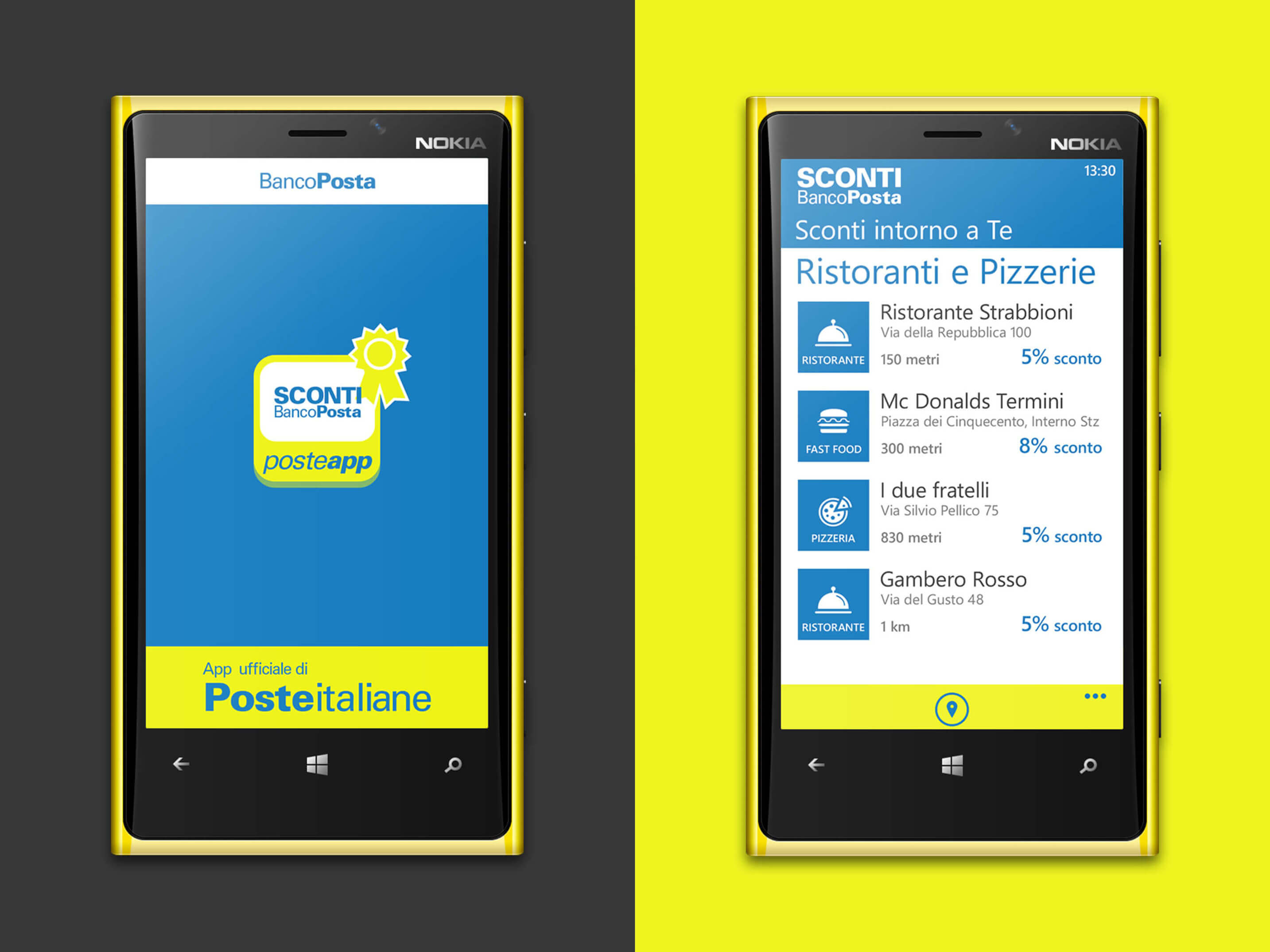
At its core, TITAN proposed a multifunctional payment card as the gateway to an interconnected service model. By unifying transport, utilities, vouchers, and loyalty, the project transformed abstract financial mechanisms into tangible, everyday interactions, making complexity legible and value visible.
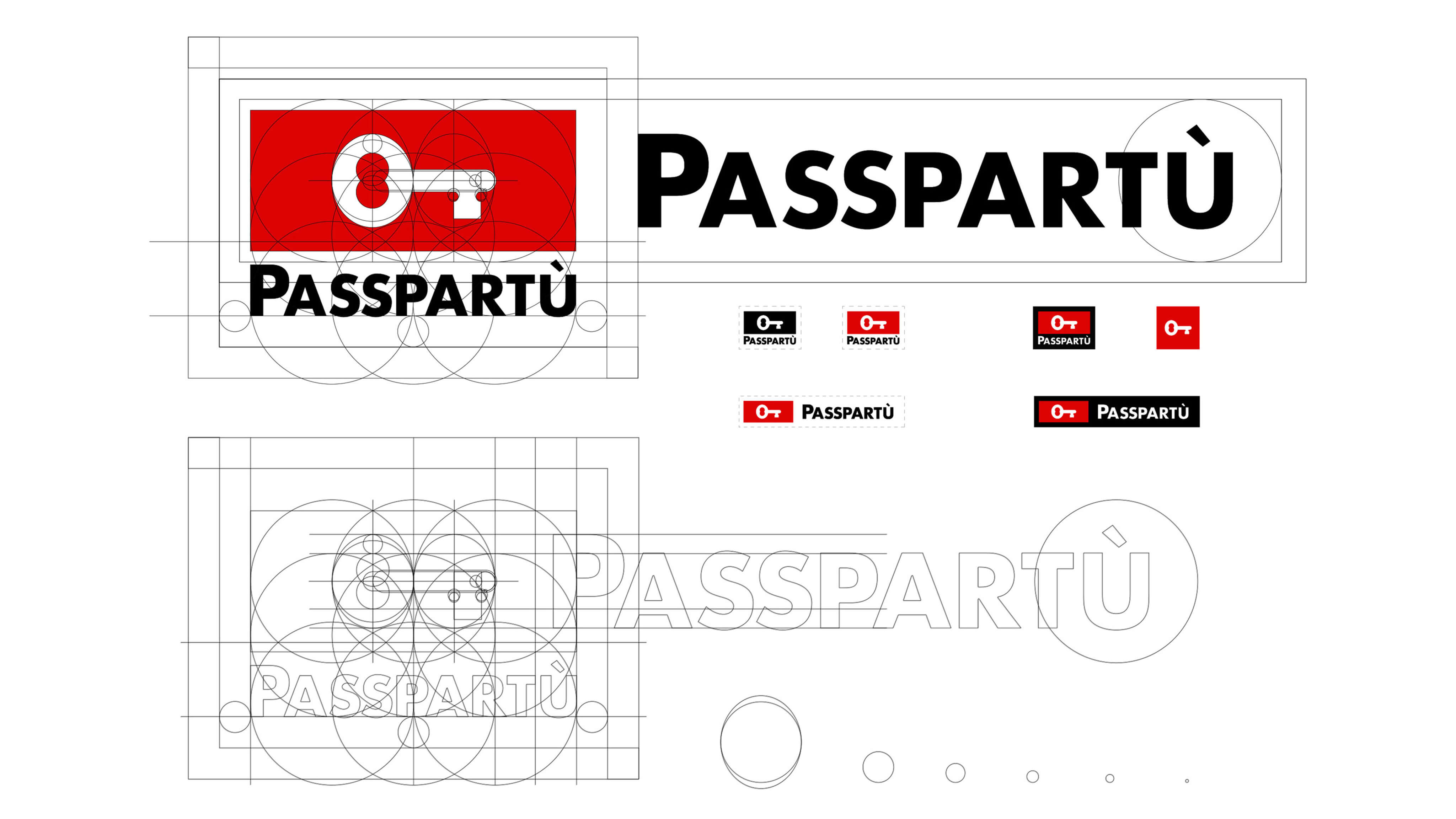
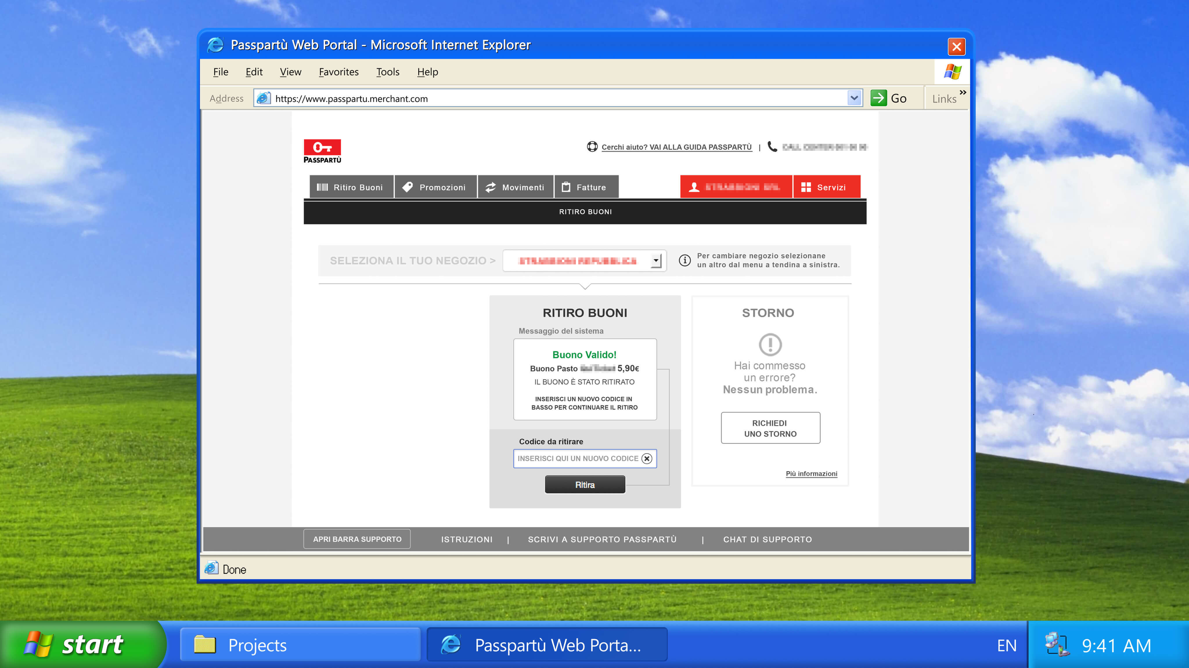
A decisive step was extending the ecosystem into physical acceptance systems, POS, ATMs, and smart registers, bridging the digital and material dimensions of financial interaction. Design patterns ensured continuity between operator and end-user experiences, making the system resilient and inclusive.
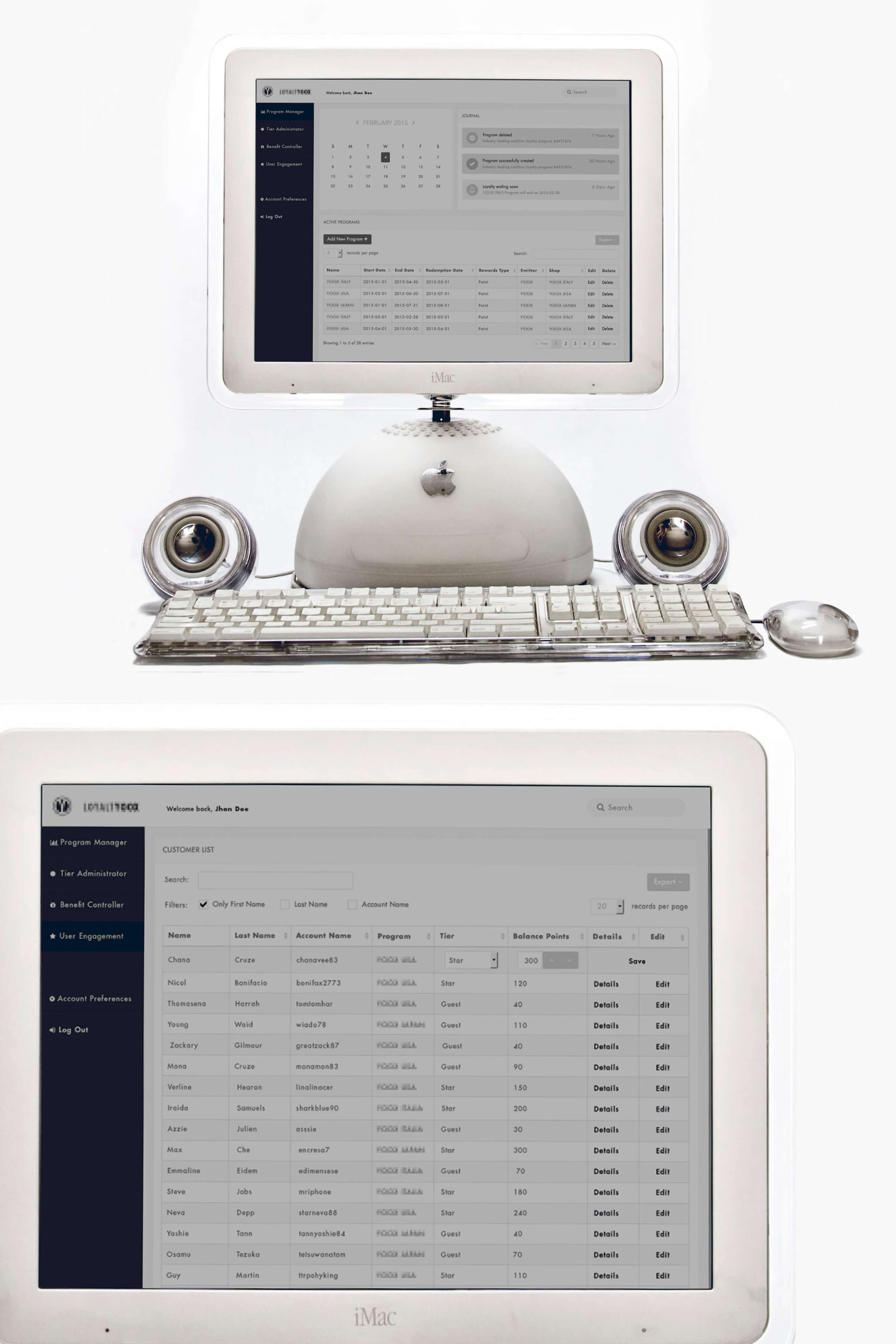
The case brings together the payment concept, identity studies, process maps, and screen proposals shown above. These artefacts document the contribution within TITAN; subsequent adoption is not established here. Learn more about MIUR NOP 0102136 Titan →
Driveken App · Master’s Thesis Project in Visual Design (Advertising Track)
SPD, School of Design, Milan in partnership with Heineken Italy · 2009 · iPhone OS 2
Academic context: Postgraduate thesis project, Master’s in Visual Design, SPD, School of Design, Milan. Supervised by Paolo Iabichino.
| Challenge | Methodology | Outcome |
|---|---|---|
| Raise awareness about drunk driving among young people through interactive experiences in nightlife venues, moving beyond static campaigns. | Designed immersive AR installations using OpenGL, deployed in bars and clubs. Integrated physical triggers and coin-operated activators to prompt reflection within familiar social settings. | Merged AR with public safety messaging in a direct, memorable way. Demonstrated the power of immersive media to communicate social issues, setting an early example of purpose-driven interaction design. |
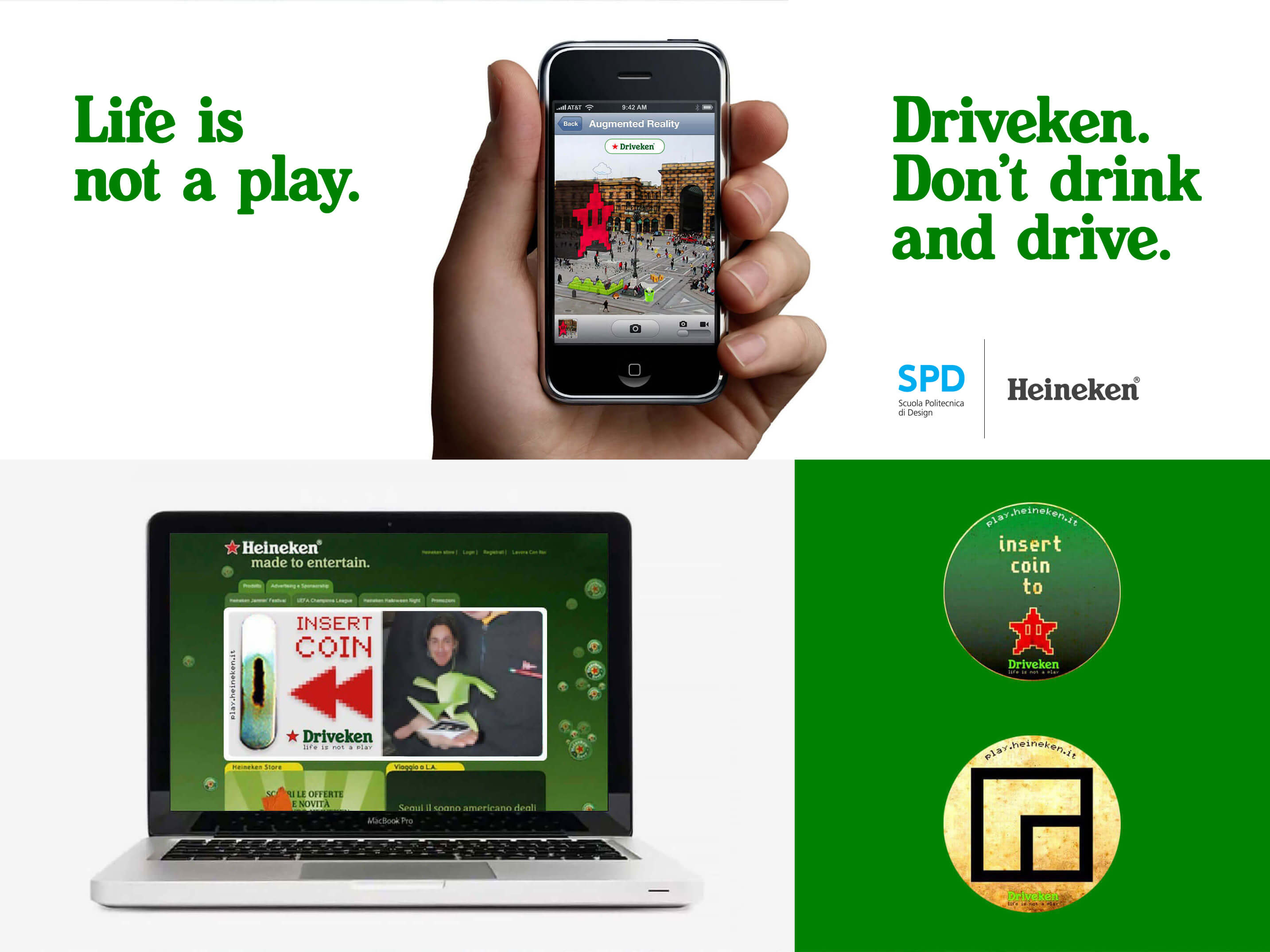
Driveken explored how augmented reality could be applied to social responsibility campaigns, years before the technology became mainstream. Titled "Driveken, Life is not a play," the project used OpenGL-based AR installations in bars and clubs to make drunk-driving risks visceral and immediate, rather than abstract.
Created in collaboration with Giacomo Brivio, Federico Bucchi, and Alberto Spada under the supervision of Paolo Iabichino. What the project left behind was not a campaign. It was a question: why does augmented space produce a reaction that a screen never could? That question did not have a name in 2009. It took fifteen more years, a framework, and a research program to build one. Learn more about SPD, School of Design, Milan →
Talks
Talks connect emerging technology with perception, creative practice, and learning, across academic institutions, conferences, and public events.
Topics
Immersive interfaces and ergonomics · Cognitive tools · Games and player experience · XR teaching and curricula · Methods for exploring emerging platforms.
From Gaming in Apple Developer Academy
Selected Events
- Panel: ARTE program | Apple Developer Academy Napoli Comicon
- Tutorial: Designing Human-Centred Spatial Experiences XR Salento
- Panel: Apple Academy: A Digital Renaissance Napoli Comicon
- Workshop: FutureCraft. Prototyping Tomorrow’s Technology Naples Design Week
- Workshop: Redefining the Visible. visionOS Desina Festival
- Panel: Gaming in Apple Developer Academy Giffoni Good Games
Publications
Writing that connects theoretical foundations with practical questions, from visual perception to immersive technology.
Book
- Book
Fare cinema disegnato. Il cartoon animato spiegato a mio nipote
Analysis of animated film production and visual design principles through the lens of Gestalt Psychology. Developed from graduate research at SPD, School of Design, Milan.
Articles: Industry & Professional
9 articles published with Create with Swift, organised in three thematic clusters below.
Cognitive Ergonomics & Interface Foundations
- Ergonomics · Create with Swift · 2025
K.I.T.E. UX. The First Spatial Ergonomics Benchmark for XR
An earlier article introducing the tool and its theoretical approach. The original published title is retained here; “benchmark” describes that framing, not evidence of empirical validation.
- Ergonomics · Create with Swift · 2025
Solid Interfaces for visionOS: Widgets and Cognitive Space in Spatial Computing
Argues that persistent spatial widgets require a cognitive grammar, not just a visual one, proposing compositional rules grounded in proprioception and fatigue budgets.
- Ergonomics · Create with Swift · 2024
Embracing Imaginary Spatial User Experience in visionOS
Practical guidelines for presence-based systems, where interaction extends beyond a flat surface into the space around a person.
Clinical & Social Applications
- Clinical · Create with Swift · 2024
Revolutionizing Surgery and Medical Treatments with visionOS
Methodology development in clinical XR contexts, where spatial ergonomics and cognitive clarity are not preferences but patient safety requirements.
- Clinical · Create with Swift · 2024
The Speculative Spatial Design Canvas
Introduces the canvas as a shared language for multidisciplinary teams, with prompts for games, applications, and clinical scenarios on Apple Vision Pro.
Design Pedagogy & Foundations
- Pedagogy · Create with Swift · 2024
Pioneering Spatial Computing Education: From iOS to visionOS
Examines the transition from mobile-first teaching to immersive environments and the new perceptual and technical questions this raises for learners.
- Pedagogy · Create with Swift · 2024
Embracing Spatial Computing: Game Design in visionOS
Explores agency, narrative, and interaction through games, examining how composition and player choices work in immersive environments.
- Pedagogy · Create with Swift · 2024
Diving Deep into Spatial Design for visionOS
An introduction to immersive computing, covering its constraints, opportunities, and the cognitive demands of presence.
- Pedagogy · Create with Swift · 2023
Extended Reality (XR): visionOS Challenges
An early mapping of visionOS challenges, with attention to adaptation, embodied interaction, and perception.
About
Design direction for human-centred XR and AI systems across research, education, and institutional infrastructure.
The work spans three layers: spatial and AI systems design, programme and institutional architecture, and research-driven education grounded in cognitive ergonomics, held together by capability building: tools, curricula, and methods that outlast the collaboration that produced them. The aim is coherence: aligning perception, organisational complexity, and computation.
Current work includes the Senior Mentor Spatial Design role at Apple Developer Academy, spatial ergonomics research developing the Proxemic Scaling Model, and teaching Graphic Design as an Adjunct Professor at the University of Naples Federico II.

Connect
Collaborations with companies, institutions, and academic teams connect strategic direction with practical delivery, combining programme leadership, prototyping, and tool building.
Commercial experience spans recruitment platforms, passenger assistance, and connected products, with projects such as inPA, GESAC, and BRID documented in Work. Engagements range from product development and exploratory studies to learning programmes and advisory roles. Public activities include panels, exhibitions, and live programmes such as Napoli Comicon Festival and game-focused events with partners such as IIDEA.
Areas of engagement
Capability Building. Building systems, tools and methods that let people and organizations keep creating long after the original project ends: from early exploration to everyday use.
- Design Leadership & Delivery. Defining direction for products and services, aligning stakeholders, and working with teams from early prototypes through delivery.
- Spatial Ergonomics Research. Exploring distance, scale, and perception in XR interfaces through theoretical models and prototypes. Open to collaborations that investigate these assumptions through user research.
- Education & Curriculum Design. Developing learning programmes in visual foundations, games, and emerging technologies for universities, academies, and company teams.
- Institutional Coordination. Programme architecture and delivery for complex multi-institution initiatives: exhibitions, public events, research labs, innovation programmes.
Strategic Direction & Systems Design. Connecting product strategy with investigation and prototyping to help teams adopt new tools, including XR and agentic workflows.
Keynotes & Masterclasses. Sessions on creative methods, pedagogy, and how emerging technologies change professional practice.
For enquiries and collaborations, write directly. Typical reply within 3 business days.